

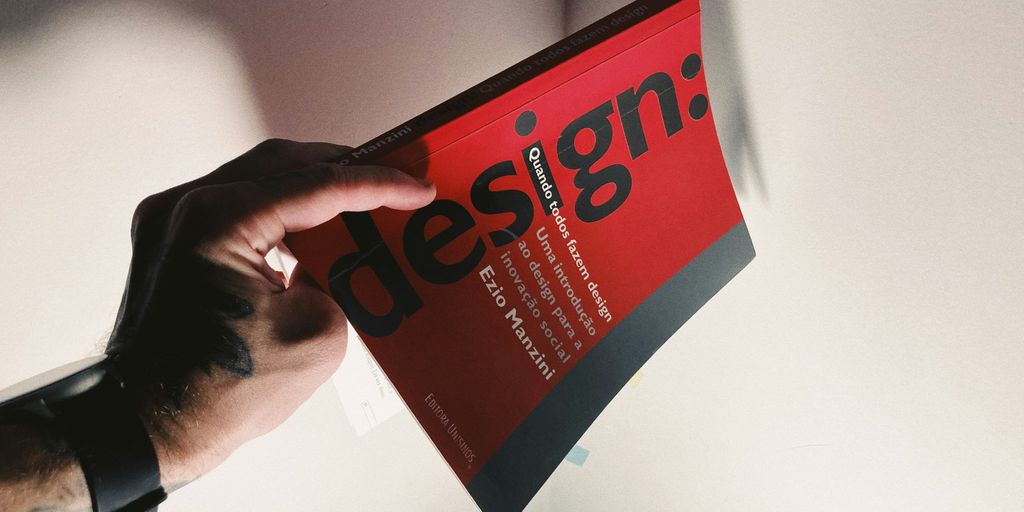
You know, building a style guide might sound like a lot of work, but honestly, it’s pretty important if you want people to actually recognize your brand. Think of it like a recipe for your brand’s look and feel. Without one, things can get messy really fast, with everyone doing their own thing. This guide will help you sort out all the important bits so your brand stays consistent, no matter where it shows up. We’ll cover everything from your core message to how your logo should be used, what colors to pick, and even how your writing should sound. It’s all about making your brand clear and memorable.
Key Takeaways
- Start by figuring out what your brand is all about – its mission, vision, and what makes it unique.
- Get your visual elements sorted, like logos, colors, and fonts, so they’re used correctly every time.
- Decide on a look for your photos and illustrations, and how icons will fit in.
- Think about how your brand should sound in writing and set some rules for that.
- Put it all together with clear instructions on how to use everything, for both online and print stuff.
Define Your Brand’s Core Identity
Before you even think about colors or fonts, you need to nail down what your brand is all about. This is the bedrock, the absolute core of your identity. Without this clarity, everything else you build visually might feel a bit… off. It’s like trying to decorate a house before you’ve even decided on the foundation. So, let’s get this right.
Outline Your Mission, Vision, and Values
Think about why your brand exists. What problem are you solving? What future are you trying to create? Your mission statement is your purpose, your vision is the aspirational future, and your values are the guiding principles. These aren’t just corporate buzzwords; they should genuinely reflect what drives your company. For example, a company focused on sustainability might have a mission to reduce waste, a vision to see a world with less pollution, and values like environmental responsibility and ethical sourcing. These statements help everyone understand the ‘why’ behind the brand.
Articulate Your Brand’s Character and Market Position
What’s your brand’s personality? Are you playful and quirky, or serious and authoritative? Who are you trying to reach, and where do you fit in the market compared to competitors? Understanding your target audience is key here. Think about their needs, their language, and their aspirations. Then, figure out how your brand can uniquely meet those needs. This helps you carve out your space and speak directly to the people who will connect with what you offer. It’s about knowing who you are and who you’re talking to.
Identify What Sets Your Brand Apart
What makes you different? Seriously, dig deep. Is it your unique product feature, your exceptional customer service, your innovative approach, or maybe your company culture? Pinpointing your unique selling proposition (USP) is super important. This is what makes customers choose you over everyone else. It could be something as simple as faster delivery times or as complex as a proprietary technology. Clearly defining this differentiator will inform all your other branding efforts and make sure your message is clear and compelling. It’s your special sauce, so make sure everyone knows what it is. You can find more about the eight core brand elements that make up a brand’s identity.
Establish Visual Brand Elements
Now that you’ve got your brand’s core identity sorted, it’s time to get down to the nitty-gritty of how your brand actually looks. This is where you define the visual language that people will come to recognize. Think of it as the uniform your brand wears every day.
Logo Usage and Variations
Your logo is probably the most recognizable part of your brand, so it’s super important to get its usage right. You need to show exactly how it should be used, and just as importantly, how it shouldn’t be used. This means including:
- Primary Logo: The main version.
- Secondary Logos/Variations: Like stacked versions, horizontal versions, or simplified icons for smaller spaces.
- Clear Space: How much empty room needs to be around the logo.
- Minimum Size: The smallest it can be without losing detail.
- Incorrect Usage: Examples of what not to do, like stretching it, changing colors, or adding effects.
Having clear rules here stops your logo from looking wonky across different applications. It’s all about maintaining that professional look and feel. You can find some great examples of how to present these rules in a brand style guide.
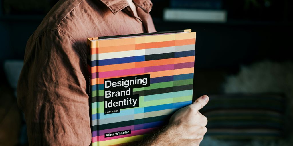
Core Color Palette Selection
Colors have a huge impact on how people feel about your brand. Picking the right ones is key. Your style guide should list your primary and secondary colors, along with their specific values. This usually includes:
- Primary Colors: The main colors that represent your brand.
- Secondary Colors: Accent colors that complement the primary ones.
- Color Values: Specific codes for digital (HEX, RGB, HSL) and print (CMYK, Pantone) so colors stay consistent everywhere.
Studies show that using a signature color can really boost brand recognition, so make sure your palette is well-thought-out and consistently applied. It helps people identify your brand instantly.
Typography Hierarchy and Application
Typography is more than just picking a font; it’s about how you use text to communicate. A good style guide will lay out your brand’s type system. This includes:
- Primary Typeface: The main font used for headlines and body text.
- Secondary Typeface (Optional): A complementary font for specific uses.
- Hierarchy: How different font weights (bold, regular, light) and sizes are used for headings (H1, H2, H3), body copy, captions, and other text elements.
- Usage Rules: Guidelines on line spacing, letter spacing, and how text should be aligned.
Getting typography right makes your content readable and reinforces your brand’s personality. Whether it’s a website, a brochure, or a social media post, consistent typography makes everything look polished and professional.
Specify Imagery and Iconography Standards
Beyond just logos and colors, how your brand looks in pictures and with icons is super important. It’s how people really start to recognize you, you know? Think about it – a certain style of photo or a unique icon can make you stand out.
Photography Style and Composition
When it comes to photos, we need to be clear about what works. Are we going for bright and airy shots, or something more moody and dramatic? We should probably decide on the kinds of subjects that fit our brand, too. Maybe we focus on people interacting with our products, or perhaps candid moments that show our brand’s personality. It’s also good to give photographers some pointers on lighting and framing. For instance, we might prefer natural light whenever possible, and avoid any weird camera angles. Having a few examples of what we like and don’t like is a good idea, so everyone’s on the same page. This helps make sure our photos feel like us.
Illustration Guidelines and Tone
Illustrations can add a lot of character. We need to figure out if we’re even going to use them, and if so, what kind. Are they simple line drawings, or more detailed and colorful? The tone of the illustrations matters too – should they be playful, serious, or something else? We should also think about how much detail is appropriate and what kind of style fits best with our overall look. Like with photography, showing examples of what we want and what we don’t want is key. This helps keep our illustrations consistent and on-brand. You can find some great examples of how brands use illustrations in their style guides to get ideas for inspiration.
Iconography Design and Usage
Icons are like the little visual shortcuts for our brand. They need to be clear and easy to understand. We should decide on a consistent style for all our icons – maybe they all have rounded corners, or a specific line weight. It’s also important to show how these icons should be used. Are there certain places they always go? Do they need a specific amount of space around them so they don’t get lost? We should also include examples of what not to do with our icons, like stretching them or changing their colors. This makes sure our icons always look sharp and recognizable, no matter where they show up.
Dictate Brand Voice and Tone

Your brand’s voice is how it sounds when it speaks. It’s not just about what you say, but how you say it. Think about it like a personality for your business. Does your brand sound friendly and casual, or is it more serious and professional? Getting this right is super important because it helps people connect with you. A consistent voice makes your brand feel real and trustworthy.
Define Your Brand’s Personality in Communication
Start by thinking about who your brand is. Is it the wise old mentor, the energetic friend, or the helpful expert? Jot down some adjectives that describe your brand. For example, you might land on words like ‘approachable,’ ‘innovative,’ and ‘reliable.’ Then, think about how those traits translate into actual language. If your brand is approachable, you’ll probably use simpler words and maybe even some contractions. If it’s innovative, you might talk about the future and new ideas.
Establish Language, Vocabulary, and Writing Style
This is where you get specific. What kind of words does your brand use? Are there any industry terms you should use or avoid? Maybe you have a specific way of handling punctuation or capitalization. For instance, some brands capitalize certain words to make them stand out, while others stick to standard rules. It’s also good to think about sentence structure. Do you use short, punchy sentences, or longer, more descriptive ones? Having clear rules here helps everyone on your team write in the same way. You might want to create a list of ‘do’s and ‘don’ts’ for your team. For example:
- Do: Use active voice.
- Do: Keep sentences clear and concise.
- Don’t: Use overly technical jargon.
- Don’t: Use clichés.
Provide Writing Samples and Examples
Words on a page are one thing, but seeing your brand voice in action is even better. Include a few examples of how your brand should sound in different situations. This could be a sample social media post, a snippet from a blog article, or even a customer service email. Showing both good and bad examples can be really helpful. It makes it super clear what you’re aiming for and what to steer clear of. This helps everyone get on the same page and represent the brand accurately, no matter where they’re writing from. Adapting your brand’s tone of voice is important for connecting with new markets, and these examples can help with that process. Check out this resource for more on adapting your voice.
Create Comprehensive Usage Guidelines
Once you’ve nailed down the core visual and verbal elements of your brand, the next step is to get super specific about how everything should actually be used. This is where you lay out the rules of engagement for your brand’s identity, making sure it’s applied consistently everywhere. Think of it as the instruction manual for your brand’s appearance and communication.
Formatting Preferences and Copy Guidelines
This section is all about the nitty-gritty details of how your written content should look and feel. It goes beyond just the fonts and colors we talked about earlier. We need to cover things like:
- Spacing: How much space should be between paragraphs? What about line spacing within paragraphs? Getting this right makes text easier to read.
- Punctuation: Are we using the Oxford comma? What kind of quotation marks are preferred? These small details add up to a consistent voice.
- Capitalization: When do we capitalize job titles? What about product names? Clear rules here prevent confusion.
- Number Formatting: How should numbers be presented? As digits (1, 2, 3) or spelled out (one, two, three)? This depends on the context and your brand’s style.
Rules for Digital and Print Materials
Your brand needs to look good whether it’s on a screen or on paper. This part of the guide clarifies the specific requirements for different mediums. For instance, digital assets might need different file formats or color profiles than print materials. We need to think about:
- Resolution: What DPI (dots per inch) is needed for print versus web?
- File Types: Which file formats (like JPG, PNG, SVG, PDF) are approved for different uses?
- Bleed and Margins: For print, what are the safe zones and bleed areas for designs?
- Screen vs. Print Colors: Understanding the difference between RGB (for screens) and CMYK (for print) is key.
Social Media and Email Design Standards
These platforms have their own unique requirements and best practices. Your style guide should offer clear direction on how to adapt your brand for these channels. This includes:
- Profile Pictures and Banners: What are the correct dimensions and approved logo variations for social media profiles?
- Post Templates: Are there specific templates or layouts for social media posts to maintain visual consistency?
- Email Signatures: What information should be included, and how should it be formatted in email signatures?
- Call-to-Action Buttons: How should buttons look in emails and on social media to align with your brand?
Ultimately, these guidelines are here to make sure your brand’s message is clear and consistent, no matter where or how it appears. Having these detailed instructions helps everyone involved in creating content or designs to represent the brand accurately, which is super important for building recognition and trust. You can find more information on creating these kinds of detailed instructions on brand guidelines.
Organize and Share Your Style Guide
So, you’ve put in the work to define your brand’s visual identity, from the logo to the colors and fonts. That’s awesome! But what good is all that if no one can find it or use it correctly? That’s where organizing and sharing your style guide comes in. Think of it as the instruction manual for your brand’s look and feel. A well-organized guide makes sure everyone, from your internal team to external partners, is on the same page.
Structure Your Brand Book for Clarity
When you’re putting your style guide together, think about how someone will actually use it. Nobody wants to dig through a giant, unsearchable PDF. Start with a clear table of contents. You can break it down into sections like "Logo Usage," "Color Palette," "Typography," and so on. Within each section, use headings and subheadings to keep things tidy. It’s also a good idea to include a quick-reference section, maybe a one-pager, with the absolute essentials like color codes and font names. This way, people can quickly grab what they need without getting lost.
Host Your Style Guide Online for Accessibility
Printing out a massive document isn’t always practical, and it can get outdated fast. Hosting your style guide online makes it super accessible. You can use a dedicated platform, a section on your website, or even a shared cloud document. The key is that it’s easy to find and always up-to-date. This also makes it simple to share with new team members or external agencies. Just send them a link! It’s a much cleaner way to manage your brand assets and ensures everyone is working with the latest version. Plus, it helps you maintain a consistent social media presence across all platforms.
Include Resources and Points of Contact
Beyond just the rules, think about what else people might need. Include links to download logo files, color swatches, or font files if possible. And just as important, list who people should contact if they have questions. Maybe it’s the marketing manager or a specific design lead. Having a clear point of contact avoids confusion and makes sure questions get answered efficiently. This makes your style guide a truly useful tool, not just a document.

Putting It All Together
So, you’ve put in the work to build a style guide. That’s awesome. It’s not just a bunch of rules; it’s the blueprint for how your brand shows up everywhere. When people see your logo, colors, or read your words, they should just know it’s you. That’s the power of a good style guide. It makes your brand instantly recognizable, no matter where it pops up. Keep it handy, update it when needed, and let it guide everything you do. Your brand deserves to be clear and consistent, and this guide is how you make that happen.
Frequently Asked Questions
What exactly is a style guide?
A style guide is like a rulebook for your brand. It tells everyone how to use your logo, what colors to pick, and what fonts to use so that your brand always looks the same, no matter where people see it. It makes your brand easy to recognize.
What goes into a style guide?
You should include things like your logo and how to use it, your main colors, the fonts you like, the kind of pictures or drawings that fit your brand, and how your brand should sound when it talks. It’s basically all the stuff that makes your brand look and feel unique.
Why is a style guide important for a brand?
Having a style guide helps everyone who works with your brand, like designers or people writing posts, know exactly what to do. This way, everything your brand puts out looks consistent and professional, which builds trust with customers.
What is meant by ‘brand voice and tone’?
Think of your brand’s personality. Is it fun and playful, or serious and professional? Your brand voice is how you write and talk to people. The style guide explains if your brand should sound casual and friendly, or more formal and expert.
Can a style guide be changed or updated?
Yes, absolutely! Brands change over time. Your style guide should be updated whenever your brand evolves. It’s a living document that makes sure your brand stays current and relevant.
Why should I put my style guide online?
Putting your style guide online makes it super easy for everyone to find and use, no matter where they are. If you update it, everyone sees the new version right away, so you don’t have to worry about people using old rules.