Thinking about how to make your company’s website stand out in 2025? It can feel overwhelming, but looking at what other tech companies are doing can give you some solid ideas. We’ve put together a list of technology website examples that really hit the mark. These aren’t just pretty pages; they’re smart designs that connect with people and get the job done. Let’s check out some of the best.
Key Takeaways
- Effective technology website examples often balance a clean look with easy navigation.
- Clear communication of what the company does and its benefits is super important.
- Unique branding helps a site get noticed without sacrificing user-friendliness.
- Good use of images and visuals can make complex tech easier to understand.
- Even simple designs can be impactful if they focus on what the user needs.
1. Transpoco
Transpoco’s website really stands out, and it’s a great example of how tech companies can use design to tell their story. The way they’ve incorporated their logo into light trails across the site is pretty clever. It’s not just there to look cool; it actually reinforces what they do – tracking and movement. This kind of detail makes the brand memorable.
They’ve also nailed the use of white space. Everything feels open and easy to look at, which helps their main points pop. The color scheme is a nice mix too, feeling both professional and energetic. It uses solid colors alongside softer gradients, giving it a dynamic vibe without being overwhelming.
What’s really good here is that even with all the creative touches, the site is super easy to use. You can find what you need without getting lost. It shows that a visually interesting site doesn’t have to be complicated to navigate. It’s a solid win for user experience.
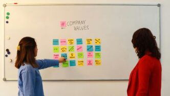
2. UNITED24 Rebuild Map
The UNITED24 Rebuild Map is a really interesting project that uses technology to show the progress of rebuilding efforts in Ukraine. It’s not just a static page; it’s a dynamic, interactive map that visualizes reconstruction projects.
What makes it stand out is its dark UI with bright, neon green highlights. This contrast really makes the important details pop, like where projects are happening or how much has been donated. It’s easy to see what’s going on, even with a lot of information.
Instead of just telling you about the rebuilding, the site shows you. You can switch between a map view and a list view, which makes it super simple to find what you’re looking for. The design itself is pretty clean and straightforward. You get the main info right away, and buttons for donating or filtering projects are easy to find without being in your face.
They also put their UNITED24 logo front and center, which builds trust. Seeing real-time donation numbers adds another layer of transparency. This approach shows how data visualization can be used effectively to communicate complex situations and encourage support. It’s a solid example of how a website can be both informative and engaging, especially for a cause that needs global attention.
3. Superlist
Superlist is a productivity app that really gets the whole ‘get to the point’ thing. When you land on their site, you know exactly what they’re about within seconds: making teams and individuals more efficient and better at working together. They use simple visuals, like a notebook, headphones, and a keyboard, to set the scene.
As you scroll, they keep things clean with plenty of white space, so you can focus on what they’re saying. It feels like they’ve thought about every little detail, even down to the notification button that feels nice to click. They also use a little arrow to guide you down the page, which is a neat touch.
Here’s what makes their site stand out:
- Clear purpose: You understand their product’s value right away.
- Minimalist design: Lots of white space keeps the focus on the message.
- Interactive elements: Small details like the notification button add a nice feel.
- Visual cues: Simple icons and arrows help guide the user experience.
4. Clay
Clay’s website really nails that tricky balance between being super unique and still looking totally professional. They’ve got this "fairy garden" vibe going on, which sounds a bit out there for a tech company, but honestly, it works. It makes them stand out in a sea of websites that all start to look the same, without making you doubt if they know what they’re doing.
The design is clean and fresh, which is great, but they don’t sacrifice important info to achieve that minimalist look. You know how some sites are so sparse you can’t find anything? Clay avoids that. They use little decorative touches, like flowers, that give the site personality, but they don’t get in the way of the product details when you need them.
What’s really cool is how they just go against the grain. Instead of following the usual tech website playbook, they’ve created something memorable. It’s a good reminder that you don’t have to be boring to be taken seriously.
Here’s what makes their approach effective:
- Clear Value Proposition: Right away, you get what Clay does and why it matters. No guessing games here.
- Benefit-Focused Features: They show you what their tools can do for you, not just a long list of technical specs. It’s all about the results.
- Smart Visuals: Product images and interface shots are used well, helping you picture using their stuff. They’re presented in a way that’s easy to grasp.
- Unique Brand Identity: The "fairy garden" theme, while unusual, is executed consistently, making the brand instantly recognizable.
5. N-Zyte
N-Zyte’s website is a great example of how you don’t need a lot of bells and whistles to make a strong impression. They went with a really simple design, focusing on just the important stuff. It’s clean, modern, and gets straight to the point, which is super helpful when you’re trying to figure out what a company does.
What’s neat is how they use their logo shape with image masks. It adds a bit of depth and visual interest without making things complicated. You see the logo shape popping up behind different parts of the site, which is a clever way to make it memorable. They kept the color scheme pretty simple too, but it works.
For tech startups, especially those just getting off the ground, N-Zyte shows that you can build a professional online presence without a massive budget. It proves that thoughtful simplicity can be really effective. It’s all about presenting what visitors need to know clearly and without any clutter.
Here’s what makes their approach stand out:
- Focus on core message: No distracting elements, just what matters.
- Smart visual details: Using logo masks for depth and interest.
- Clean and modern aesthetic: Easy to look at and understand.
- Budget-friendly approach: Demonstrates effectiveness without high costs.
6. CoLab
CoLab’s website really nails it by showing you exactly what they do right up front. They pair clear explanations of their product with sharp visuals that show it in action. You can’t miss their calls to action either; they use bright colors against a darker theme, which makes them pop and guides your eye exactly where they want it.
What’s cool is how they show off their product. These aren’t just plain screenshots. They’ve put together some really polished, high-quality visuals that make the product look good while still being easy to understand. It’s a smart way to present things.
They also switch between light and dark backgrounds, which is a nice touch. The lighter backgrounds are used when they’re going into more detail, making it easier to read. It shows they’ve thought about how people actually use a website and what makes reading easier. It’s a good example of how a tech site can look professional and get its message across without being overly complicated.
7. SPINX Digital
SPINX Digital really knows how to make a website that grabs your attention. From the moment you land on their site, you can tell they’re all about digital innovation. They’ve got this cool, cinematic feel going on with bright colors and simple navigation that just pulls you in. It’s not overly complicated, which is nice because you can actually find what you’re looking for without getting lost.
One thing that stands out is their use of color, especially that bright green. It ties right into their logo and makes the site pop. Plus, their designs are super responsive, meaning they work well no matter what device you’re using. They also use icons and clear text really well, so you get the important info without a bunch of clutter. It’s a great example of how a website can showcase a company’s skills by being engaging and easy to use.
They’ve even been recognized for having an SEO-friendly design, which is no small feat. They clearly put thought into how content is placed and how keywords are used. It’s a smart approach that helps them stand out. If you’re looking for a web design agency that gets it, SPINX Digital is definitely worth checking out. They show that a well-designed site can really speak to people and highlight what a business does best. It makes you think about how important it is to get professional help when building a site, rather than trying to do it all yourself hiring a professional.
Here’s what makes their approach effective:
- Bold Visuals: They aren’t afraid to use strong colors and compelling typography to make an impact.
- User-Focused Navigation: Getting around the site is straightforward, guiding visitors to the information they need.
- Clear Communication: Essential details are presented concisely, avoiding overwhelming the user.
- Responsive Design: The website adapts well to different screen sizes, ensuring a good experience for everyone.
8. Torgerson Design Partners
Torgerson Design Partners really gets how to make a website feel both professional and approachable. They’ve built a site that’s a great example for any business looking to show off their work, especially if they’re in a creative field.
What stands out is how they use visuals. Instead of just throwing up pictures, they’ve got this really clean layout that lets the projects speak for themselves. It’s not cluttered, which is a big plus. They manage to balance a modern look with a user-friendly feel, making it easy for visitors to find what they’re looking for without getting lost.
Here’s what makes their site work so well:
- Clear Navigation: You can easily hop between their services, portfolio, and contact info. No guessing games here.
- Strong Visual Hierarchy: Important stuff, like their case studies or client testimonials, is presented in a way that naturally draws your eye.
- Brand Consistency: The whole site feels like it belongs to one company. The colors, fonts, and overall tone are all in sync, which builds trust.
It’s a solid example of a design agency website that doesn’t just look good but also functions perfectly to attract and inform potential clients. They show that a website can be a powerful tool for showcasing your brand’s personality and capabilities.
9. Locomotive – Swab the World
Locomotive’s website for Swab the World is a really cool example of how design can support a cause. This site is all about getting more people to sign up as stem cell donors, aiming to make the global donor bank more diverse. Right away, the colors grab you – this mix of umber and teal isn’t something you see every day, and it just works.
What’s neat is how the site guides your eye. There are these little moving balls on the right side that subtly encourage you to look across the whole page. It’s a smart way to keep you engaged without being pushy.
Here’s what makes it stand out:
- Unique Color Palette: The umber and teal combination is memorable and sets a distinct tone.
- Engaging Visuals: Subtle animations and movement draw users in and keep their attention.
- Clear Call to Action: The site effectively communicates its mission and encourages participation.
It’s a great reminder that a website can be both visually striking and deeply meaningful.
10. Superhero Cheesecake – The Year of Greta

Superhero Cheesecake really knocked it out of the park with "The Year of Greta." This wasn’t just another website; it was a passion project that turned into a digital timeline, charting Greta Thunberg’s journey from a young activist to a global figure. It’s a fantastic example of how to use a recognizable, powerful personality to create compelling online content.
What makes this site so effective is its visual storytelling. They took a significant, well-known figure and built an engaging narrative around her impact. It’s a smart move when you have someone like Greta; her story is already inspiring, and presenting it in an accessible, digital format makes it even more impactful.
Here’s what stood out:
- Clear Narrative Flow: The timeline format made it easy to follow Greta’s progression and understand the milestones in her activism.
- Visual Appeal: The design was engaging without being overly complicated, keeping the focus on the story.
- Impactful Subject Matter: Using a real-world, influential person like Greta Thunberg immediately grabs attention and lends credibility.
This project shows how a website can be more than just a digital brochure; it can be a platform for powerful storytelling and raising awareness. It’s a great case study for anyone looking to build a site around a significant event or person. You can see how they used the character’s background to inform the design choices.
Wrapping It Up
So, we’ve looked at a bunch of cool tech websites that really get it right. It’s not just about looking pretty, though that helps. These examples show that a good website makes it super clear what you do and why someone should care. They also prove you don’t need a million-dollar budget to make something that works well and feels unique. Think about what makes your brand special and how you can show that online without making things confusing for visitors. The goal is to make a site that’s easy to use and helps people take the next step, whatever that might be for your business. Keep these ideas in mind as you plan your own site for 2025 – a great website can really make a difference.