When you think about magazines that really shaped how we see technology and the future, Wired definitely comes to mind. It’s been around for a while, and its look has changed quite a bit since it first hit the stands. We’re going to take a peek at how the Wired logo has evolved over the years, from its early days to how it looks now, and what that tells us about design and the digital world.
Key Takeaways
- The original Wired logo, a mix of serif and sans-serif fonts, was designed to represent the clunky, pixelated feel of early digital communication and the tension between print and screen media.
- Over time, the Wired logo has been streamlined, particularly for its digital presence, moving towards a cleaner sans-serif look that reflects a more unified digital platform.
- The Wired logo’s design has always been distinctive and adaptable, used effectively on magazine covers to stand out and convey a sense of technological innovation.
- The visual language of Wired, including its logo and graphic design, has significantly influenced the broader cultural industry, offering a fresh perspective compared to competitors.
- The wired logo’s enduring legacy lies in its ability to remain recognizable while adapting to the changing landscape of print and digital media, acting as a symbol of digital culture.
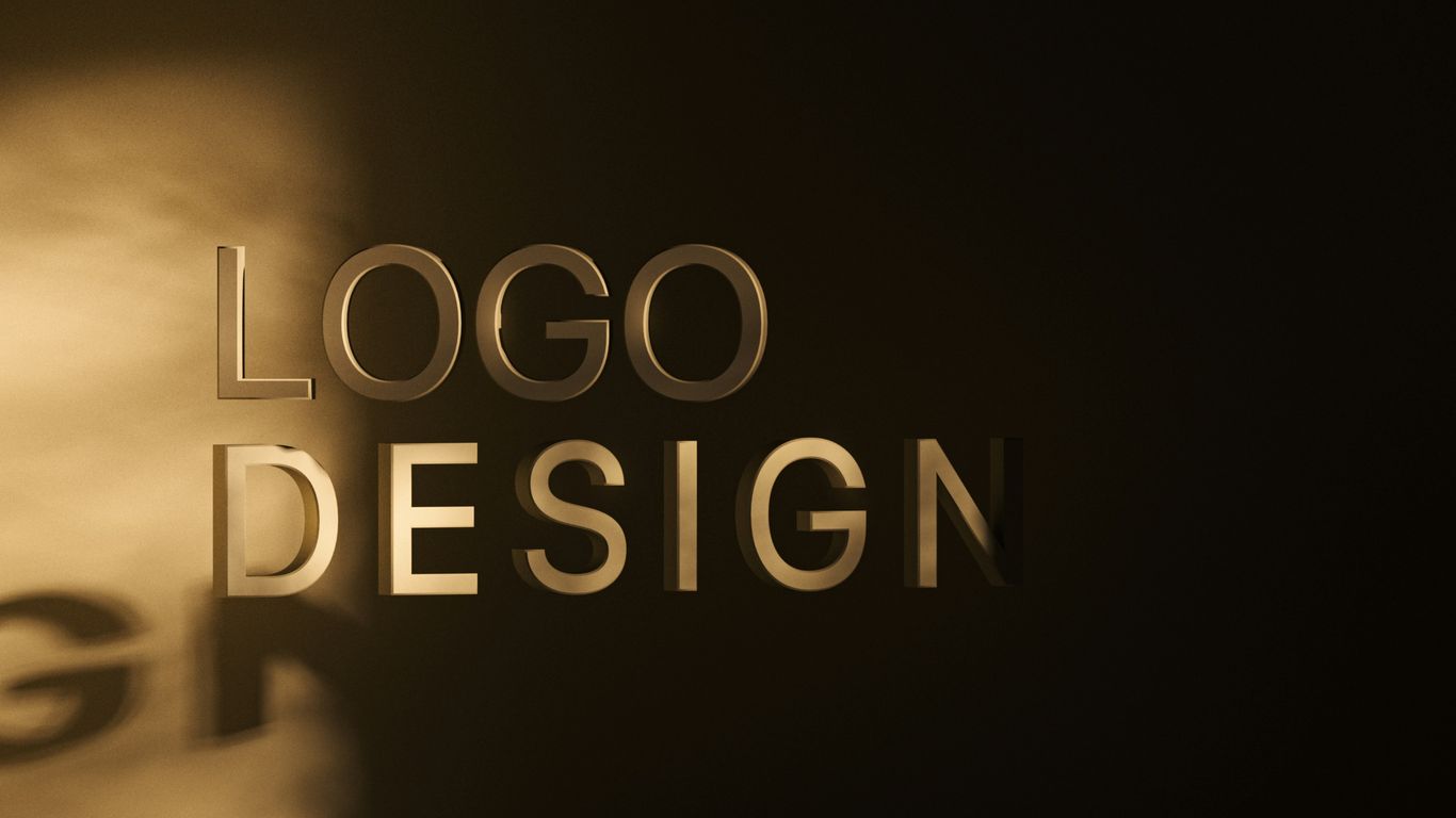
The Genesis Of The Wired Logo
When Wired first hit the scene back in March 1993, it wasn’t just another magazine. It was a statement, a bold declaration that a new digital age was dawning, and this publication was going to be our guide. The founding creative directors, John Plunkett and Barbara Kuhr, had a massive task: to create a visual identity that screamed ‘future’ without alienating readers. They were trying to capture this wild, new digital frontier, something that felt both exciting and a little bit unknown.
Founding Visionaries And Early Concepts
Plunkett and Kuhr were the masterminds behind the initial look. They weren’t just designers; they were visionaries trying to bottle the essence of this emerging digital culture. Their goal was to make Wired feel like a bridge, connecting the old world of print – what they called the ‘People of the Book’ – with the rapidly expanding world of screens, the ‘People of the Screen.’ This tension between the physical and the digital was key to their thinking. They wanted the logo to represent that dynamic, that push and pull between two different ways of experiencing information.
Signifying The Digital Frontier
The early days of the internet were a far cry from today. Think dial-up modems, clunky interfaces, and a general sense of wonder about what this whole ‘online’ thing would become. The original Wired logo was designed to reflect this. It had this blocky, almost pixelated feel, a deliberate choice to echo the digital communication of the time. It wasn’t sleek or minimalist; it was raw and energetic, much like the internet itself was back then. It was a visual representation of the digital frontier, a place still being mapped out.
A Blend Of Serif And Sans Serif
One of the most interesting aspects of the original logo was its typography. It wasn’t a simple, clean sans-serif font that we see so often today. Instead, Plunkett and Kuhr played with a mix of serif and sans-serif elements, creating a jagged, distinctive look. This combination was intentional. It visually represented the blend of old and new, the traditional print world meeting the digital one. It was a clever way to signal that Wired was about bridging these worlds, not just existing in one. The use of contrasting colors, often black and white, further emphasized this digital, almost terminal-like aesthetic, making it instantly recognizable and undeniably tech-focused.
Evolution Of The Wired Logo Through The Years
When Wired first hit the scene back in March 1993, its logo was a real statement piece. Designed by John Plunkett and Barbara Kuhr, it wasn’t just a name; it was a visual representation of the digital age that was just starting to bubble up. Think chunky, blocky letters, a mix of serif and sans-serif styles, and a deliberate use of contrasting colors, often black and white. This design really captured that early, somewhat jagged feel of digital communication, like looking at an old computer terminal. It was a bold move, setting Wired apart from the more traditional magazines on the newsstand.
The Blocky Wordmark’s Impact
That original logo was pretty impactful. It wasn’t slick or minimalist; it was raw and spoke to the tech-forward audience Wired was trying to reach. It felt like a bridge, as the designers put it, between the old world of print and the new frontier of screens. This visual tension was part of the magazine’s identity, signaling that it was something different, something that understood the evolving landscape of information.
Streamlining For The Digital Age
As the years went by, and especially around 2012, Wired started to clean things up. This was a time when tablet editions were becoming a big deal, and the magazine wanted its look to match that digital push. The logo got streamlined, shedding some of its earlier complexity for a cleaner, more unified sans-serif look. This shift reflected a desire to feel more integrated with the digital platforms, moving away from that initial tension towards a more cohesive brand identity across print and screen.
Bridging Print And Screen
Looking back, the journey of the Wired logo is a story of adaptation. From its early, almost defiant blockiness that screamed ‘digital frontier,’ to the sleeker versions that embraced the online world, the logo has always tried to keep pace. It’s a fascinating look at how a brand’s visual identity can evolve alongside the very technology it covers. The logo’s ability to morph while staying recognizable is key to its lasting presence. It’s gone from being a symbol of a nascent digital culture to an indicator of its ubiquity, mirroring the way digital has become woven into our everyday lives.
Design Innovations In The Wired Logo
Typography As A Visual Statement
When Wired first hit the scene, it really wanted to look different. It wasn’t just about the stories; the whole package had to scream ‘future.’ They played around with fonts a lot. For instance, they’d throw in Courier, a font that feels like an old typewriter, right into the logo or headers. It’s a neat trick that makes something feel both old-school and super modern at the same time. It’s like taking a classic car and giving it a rocket engine – unexpected, but it works.
The Malleable And Recognizable Wired Logo
The Wired logo itself is pretty clever. It’s got these big, chunky letters, often broken up with black and white blocks. This design makes it look like something from an old computer screen, which fits the tech theme perfectly. But it’s also simple enough that it can be changed up for different ads or features without losing its identity. Think of it like a Lego brick – you can build all sorts of things with it, but you always know it’s a Lego brick. This adaptability is key for a brand that’s always talking about what’s next.
Color And Contrast In Logo Design
Color and contrast are big players in how the Wired logo grabs your attention. They often use strong black and white, which makes the logo pop, especially on magazine covers. This sharp contrast isn’t just for looks; it helps the logo stand out in a crowded space, whether that’s on a newsstand or scrolling through a website. It’s a visual cue that says, ‘Hey, look over here, something interesting is happening.’ This bold approach to color and contrast has helped Wired create a look that’s hard to ignore and easy to remember.
The Wired Logo’s Role In Cover Design
When you see a copy of Wired on a newsstand or a coffee table, the logo is usually the first thing that grabs your eye. It’s not just a name; it’s a statement. The designers really knew what they were doing back in 1993, making a logo that could stand out. It’s this blocky, almost digital-looking thing that feels both retro and totally futuristic at the same time. This visual identity is key to how Wired presents its stories on the cover.
Juxtaposing The Logo With Featured Figures
Think about those iconic Wired covers. You’ve got the bold logo, and then right next to it, a picture of some tech giant like Mark Zuckerberg or Jeff Bezos. It’s a deliberate choice. The magazine often uses these big, close-up shots, sometimes with cool filters or bright colors, making the person pop. The logo sits there, solid and recognizable, while the featured person draws you in. It’s like they’re saying, “Here’s the future, and here’s the logo that represents it.” It’s a powerful combo that makes you want to pick it up and see what’s inside.
Typography’s Prominence On Covers
Beyond the logo itself, Wired plays around a lot with words on its covers. They’ll use big, attention-grabbing headlines, sometimes even controversial ones like “The Web is Dead” back in 2010. The way they arrange these words, the fonts they choose – it all adds to the visual punch. It’s not just about the image; the text is a design element in itself. They’ve used everything from classic typewriter fonts to modern sans-serifs, making the words as much a part of the art as the pictures. It’s a way to communicate the magazine’s vibe quickly and effectively.
Visual Language For Bookshelves And Coffee Tables
Ultimately, the Wired logo and its cover design work together to create a distinct visual language. It’s designed to be instantly recognizable, whether it’s sitting on a shelf or being flipped through. The original designers wanted it to have its own look, something that would catch your eye. They’ve played with different layouts and styles over the years, but that core logo remains. It’s become a symbol of innovation and the digital age, making the magazine a recognizable object in any collection. It’s more than just a magazine cover; it’s a piece of design that tells a story about technology and culture.
Wired Logo And The Digital Revolution
It’s kind of wild to think about how much the digital world has changed since Wired first hit the scene. Back in the day, the internet felt like this totally new, almost alien thing. Wired really captured that feeling, you know? Their logo, especially the early versions, had this edgy, almost pixelated vibe that just screamed ‘future.’ It wasn’t just a logo; it was a statement about this massive shift happening in how we communicate and live. The digital culture we tried to imagine and visualize in the mid-90s has now become the air we all breathe. It’s not a newsflash anymore, it’s just… life.
Reflecting the Air We Breathe
When you look at the Wired logo over the years, you can see this evolution. It started out a bit rough around the edges, a mix of styles that mirrored the clunky early days of digital. Then, as things smoothed out online, the logo got sleeker too. It’s like the design team was constantly trying to keep pace with technology itself. They managed to make a logo that felt both cutting-edge and familiar, which is a tough balancing act. It’s fascinating how they managed to bridge the gap between the old-school print world and the fast-paced digital space. This ability to adapt is probably why the logo still feels so relevant today, even as technology keeps changing at warp speed. It’s a testament to good design that it can represent something so dynamic.
From Newsflash to Ubiquity
Think about how Wired used to feel like a bulletin, announcing this new digital frontier. The magazine’s design, including its logo, was part of that initial excitement. It was all about exploring what was next. Now, though, digital is everywhere. It’s not just a topic; it’s how we do almost everything. The Wired logo has had to change with that, becoming more of a constant presence, a symbol of this integrated digital life. It’s less about the ‘newsflash’ of new tech and more about how tech is woven into the fabric of our lives. This shift is reflected in how the logo is used across different platforms, from print to the web, always recognizable but subtly adapted for each context. It’s a smart move that keeps the brand fresh.
The Logo as a Digital Culture Indicator
So, what does the Wired logo tell us about digital culture? Well, it’s a bit of a mirror. When the logo was more angular and experimental, it reflected a time when digital was still being figured out. As it became cleaner and more streamlined, it showed how digital became more integrated and, dare I say, normalized. It’s like a visual timeline of our relationship with technology. The designers at Wired have always been good at this – making the magazine’s look and feel match the cultural moment. They’ve managed to create a visual language that speaks to the digital generation without alienating others. It’s a tricky thing to pull off, but they’ve done it. You can see this in how they’ve used infographics to explain complex ideas, making them accessible to a broad audience.
The Wired Logo’s Enduring Legacy
It’s pretty wild to think about how much has changed since Wired first hit the scene. Back in the day, the digital world felt like this new, exciting, and maybe a little scary frontier. The original logo, with its blocky, almost pixelated look, really captured that feeling. It was a mix of old-school print vibes and that new digital edge, a perfect symbol for a magazine trying to make sense of it all. That tension between the physical and the digital is something the logo has always managed to represent.
Over the years, the logo has definitely evolved. It got sleeker, more streamlined, especially as we all started living more of our lives online. But even as it adapted, it never lost that core identity. It’s like it learned to speak both the language of print and the language of the screen, which is pretty neat when you think about it. It’s become this constant, this familiar face in a world that’s always buzzing with new tech and new ideas.
A Constant In A Changing Landscape
Think about it: the internet went from a novelty to something we can’t live without. Through all that, the Wired logo has been there. It’s seen trends come and go, technologies rise and fall, but it’s always remained recognizable. It’s a testament to solid design that it can stick around this long without feeling dated. It’s become a landmark, a signpost in the ever-shifting terrain of digital culture. It’s not just a logo; it’s a marker of time and change.
Inspiring Visual Language
Beyond just being a recognizable symbol, the Wired logo has actually influenced how other things look. Its boldness and its ability to adapt have made it a sort of blueprint for other brands trying to convey a sense of innovation and forward-thinking. It’s shown how a logo can be more than just a name; it can be a whole visual statement. It’s like how creators today are focusing on building lasting relationships with their audience, rather than just chasing fleeting attention Jack Conte, cofounder of Patreon. The logo has done something similar, building a lasting visual connection.
The Wired Logo’s Adaptability
What’s really impressive is how the Wired logo can morph and change while still being instantly identifiable. Whether it’s on a magazine cover, a website banner, or even a tiny app icon, it just works. This flexibility is key in today’s world where content pops up everywhere. It’s a design that can handle the pressure, looking good whether it’s printed on paper or flashing on a screen. It’s a survivor, and a pretty stylish one at that.
The Logo’s Journey: Then and Now
So, looking back at how the Wired logo has changed, it’s pretty clear it’s been on a wild ride. From those early, kind of jagged days that really screamed ’90s tech’ to the cleaner looks we see now, the logo has basically mirrored the whole digital world’s evolution. It started out feeling like a bridge between old-school print and this new digital stuff, and now that digital is just… everywhere. It’s interesting to see how the design team has played with it, sometimes going back to that original feel to remind us of where we came from. It just goes to show that even a logo has to keep up with the times, and Wired’s definitely done that, staying relevant whether it’s on a newsstand or a screen.