Alright, so we’re looking ahead to 2026 and what design is going to look like. It’s kind of interesting how things are shifting. We’re moving away from that super clean, perfect look that’s been around for a while. People are starting to want things that feel more real, more human, even a little messy. Plus, technology is playing a bigger role, but not in the way you might think. It’s more about how we can use it to make things more personal and maybe even a bit nostalgic. Let’s break down some of the big ideas shaping 2026 design.
Key Takeaways
- Design in 2026 is leaning into imperfection and human-centric styles, moving away from overly polished looks.
- Nostalgia is a big deal, with Y2K and older aesthetics making a comeback, especially for younger audiences.
- AI is becoming a common tool for designers, helping with research and concept generation, but human creativity is still key.
- Sustainability is no longer optional; it’s a must-have for products and brands in 2026.
- The lines between physical and digital are blurring, with products becoming more connected and integrated into larger systems.
Embracing Imperfection: The Rise of Human-Centric Design
It feels like for a while there, everything had to be super polished, right? Like, perfectly smooth surfaces, flawless gradients, and not a single stray pixel in sight. But honestly, that’s starting to feel a bit… sterile. People are craving something more real, something that shows a human touched it. This shift away from that ultra-clean, almost robotic perfection is a big deal for 2026.
The Shift Away From Polished Minimalism
We’re seeing a move towards designs that feel a little rough around the edges. Think hand-drawn elements, textures that aren’t perfectly uniform, and layouts that have a bit of playful asymmetry. It’s not about being sloppy; it’s about embracing the unique character that comes from human creation. This approach makes things feel more approachable and relatable. It’s like the difference between a factory-made chair and one your grandpa carved himself – both serve a purpose, but one has a story.
Nostalgia’s Influence on 2026 Design
There’s a definite pull towards the past, but not in a way that’s just copying old styles. It’s more about taking elements we remember fondly and giving them a fresh spin. This could mean bringing back certain color palettes, typography styles, or even the general vibe of past decades, but updated with modern sensibilities. It taps into a feeling of comfort and familiarity, which is really appealing when the world feels a bit chaotic. It’s like finding an old favorite song and hearing a new remix that makes you love it even more.
AI’s Role in Amplifying Expressive Styles
Now, you might think AI would push us further into that perfect, sterile zone, but it’s actually doing the opposite in many ways. AI tools are becoming so good at generating variations and exploring different styles that they’re helping designers push boundaries. Instead of just creating more of the same, AI can help us discover unexpected combinations and textures. It’s like having a super-powered assistant that can quickly show you a hundred different ways to make something look ‘imperfectly’ interesting. This collaboration between human intuition and AI’s processing power is what’s really driving these new, expressive aesthetics forward.
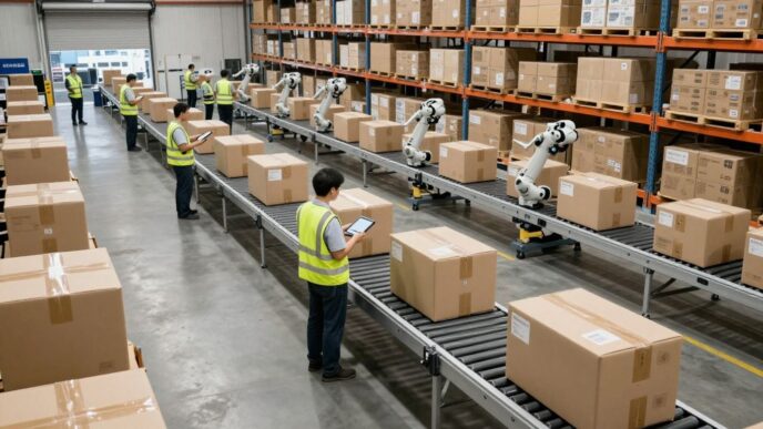
The Evolving Landscape of Product Design in 2026
Alright, let’s talk about where product design is headed in 2026. It feels like things are really shifting, and honestly, it’s getting pretty interesting. We’re seeing a big move away from just making things look super slick and perfect. People are starting to want products that feel more real, more human, you know?
AI-Assisted Design Becomes Standard Practice
So, AI is everywhere now, right? In product design, it’s not just a cool new tool anymore; it’s becoming how things are done. Think of it like this: AI can help designers brainstorm ideas way faster than before. It can look at tons of data, suggest different looks, and even help build quick models to see how things might work. This means designers can spend less time on the grunt work and more time on the creative stuff. But don’t get me wrong, the human touch is still super important. It’s more about using AI to make the design process smoother and smarter, not replacing the designer’s vision.
Sustainability: From Expectation to Obligation
Remember when ‘eco-friendly’ was a nice bonus? Well, that’s pretty much over. By 2026, making products that are good for the planet isn’t just a good idea, it’s a must-do. Companies are going to be under more pressure to use materials that can be reused or broken down easily, cut down on carbon emissions, and actually show that they’re making a difference. We’ll see more products built with parts that can be swapped out, made to last longer, and easier to fix. If a company isn’t thinking about sustainability from the get-go, they’re going to fall behind.
Hyper-Personalized Products Capture Market Share
People want things that feel like they were made just for them. And guess what? Technology is finally catching up. With things like advanced AI and better manufacturing, brands can start making custom products on a large scale. This could mean anything from furniture that adjusts to your body perfectly to apps that change based on how you use them. Products that learn from you and adapt will become more common. Brands that can offer this level of personal touch are going to win over customers and keep them coming back.
Future Medieval and Distorted Portraits: Bold New Aesthetics

Forget the sterile, perfectly polished look we’ve seen everywhere. In 2026, design is getting a lot more interesting, and a big part of that is this wild mix of old and new. We’re seeing "Future Medieval" pop up, which sounds like something out of a fantasy novel, right? It takes those old-school gothic and baroque vibes – think ornate details and dramatic flair – and smashes them together with futuristic digital effects. It’s like a knight in shining armor showing up in a cyberpunk city.
Blending History with Digital Innovation
This isn’t just about slapping a medieval font on a website. It’s about creating a whole mood. People are searching for these kinds of styles more and more, and platforms are making it easier to play around with them. It’s a way to tell richer stories and stand out from the usual minimalist stuff. Think of it as history getting a digital makeover, but with a bit of an edge.
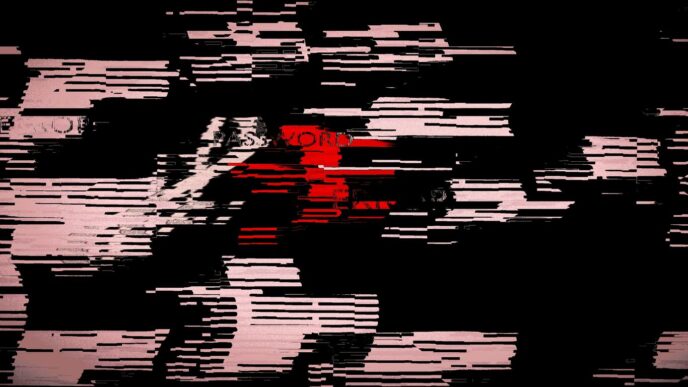
Expressive and Subversive Portraiture
Then there are "Distorted Portraits." These are portraits that aren’t afraid to be weird. They take a regular face and twist it, stretch it, or chop it up in unexpected ways. It’s a reaction against all those perfect, AI-generated faces that all start to look the same. Designers are using these distorted images to express something deeper, to be a bit rebellious, and to grab your attention. It’s about showing emotion and making you feel something, even if it’s a little unsettling.
- The Appeal of the Unconventional: People are tired of the same old thing. This trend taps into a desire for authenticity and surprise.
- Digital Manipulation: Tools now allow for complex distortions that were impossible before, pushing the boundaries of what a portrait can be.
- Emotional Connection: By breaking away from perfection, these portraits can feel more human and relatable, even in their strangeness.
The Appeal of the Unconventional in 2026 Design
Why are we drawn to this? Maybe it’s a reaction to how clean and predictable everything has become. We crave something with a bit more grit, something that feels handmade even if it’s digital. These styles are bold, they’re expressive, and they’re definitely not boring. It’s about making design that makes you stop and think, rather than just scroll past.
Navigating the Dichotomy of Human and AI in Design
It feels like every other day there’s a new article about AI taking over creative jobs. Honestly, it’s a bit much. But looking at design trends for 2026, it’s clear that the reality is way more nuanced. We’re not just seeing AI tools pop up; we’re seeing how designers are actually using them, and how that changes things.
The Return of Human-Made Visuals
After a period where everything felt super slick and maybe a little too perfect, there’s a noticeable swing back towards visuals that feel, well, made by a person. Think about those slightly wobbly lines in illustrations or textures that have a bit of grit. It’s like we’re craving something that feels more real, more tangible. A recent study showed that a lot of designers are actively looking for these more ‘human’ elements to balance out the digital side of things. It’s not about rejecting AI, but about remembering what makes design feel authentic and relatable.
AI as a Catalyst for Exploration
On the flip side, AI isn’t just a tool for making things look ‘human’ again; it’s also a massive accelerator for creativity. Designers are using AI to quickly explore tons of different ideas, test out variations, and even generate starting points they might never have thought of on their own. It’s like having a super-powered assistant that can do the heavy lifting on research and initial concept generation. This frees up designers to focus on the bigger picture, refining ideas, and adding that unique human touch.
Finding Balance in a Hybrid Creative World
So, what’s the takeaway for 2026? It’s not really about ‘human versus AI.’ It’s about how they work together. The most interesting designs are likely to come from places where human intuition and creativity are amplified by AI’s speed and data processing power. It’s about finding that sweet spot where technology helps us be more efficient and explore more, but where the final decisions and the emotional core of the design still come from us. It’s a partnership, and figuring out how to make that partnership work best is going to be a big theme.
Emerging Visual Languages for 2026 Design
It feels like design is always changing, right? Well, 2026 is shaping up to be no different. We’re seeing some really interesting new styles pop up, moving away from that super-clean, almost sterile look we’ve gotten used to. People are looking for visuals that feel more real, more expressive, and honestly, a bit more fun.
Naive Design: The Charm of the Unpolished
Remember those doodles you used to make in the margins of your notebooks? They’re making a comeback, and they’re showing up everywhere, from t-shirts to company logos. This style is all about simple lines, shapes that feel a little wobbly, and a general vibe that looks untrained but totally on purpose. It’s a refreshing change from the perfectly polished stuff. It’s the beauty of imperfection, really. It feels honest and approachable, which is something a lot of brands are aiming for these days.
Surveillance Design: Precision and Data
This one’s a bit different, but it’s gaining traction. Think about the visuals you see in security systems – CCTV screens, those little boxes that highlight faces, system logs, and monochrome overlays. Surveillance Design takes cues from that, using strict grids, simple fonts, and high-contrast colors. It’s all about precision, data, and a kind of controlled, almost dystopian feel. It works well for designs that need to communicate observation or a lot of information clearly. It’s a strong visual language that’s pretty adaptable for motion graphics too.
Grainy Blur: Evoking Emotion and Depth
People are getting a little tired of images that look too sharp and perfect. That’s where Grainy Blur comes in. It mixes soft focus with textured, grainy effects to create visuals that feel both a bit old-school and totally current. It adds a layer of warmth, depth, and authenticity that’s hard to get with super-crisp images. This style is great for social media, brand campaigns, or even album covers because it gives off a cinematic, dreamy vibe. It helps designs stand out in a really crowded digital space and connect with people on a more emotional level.
Nostalgia Reimagined: Y2K and Frutiger Aero Revival
Remember the early 2000s? That era of dial-up internet, shiny gadgets, and a general feeling that technology was going to make everything amazing? Well, it’s back. We’re seeing a big comeback for Y2K aesthetics, and especially something called Frutiger Aero. It’s like we’re all collectively looking back at the future we thought we’d get, and honestly, it feels pretty good right now.
This isn’t just about rehashing old styles. Frutiger Aero, with its glossy gradients, bubble-like fonts, and images of blue skies and water, taps into a kind of techno-optimism that feels really different from the super-clean, sometimes sterile designs we see everywhere now, especially those made by AI. It’s a visual language that feels both familiar and fresh, a bit like finding an old favorite CD in a dusty box.
Yearning for a Promised Future
Why now? Maybe it’s the world feeling a bit uncertain, or maybe we’re just tired of flat design. Whatever the reason, this trend offers a hopeful, almost utopian vision. It’s about blending the digital with the natural, creating visuals that feel optimistic and inviting. Think of those old Windows wallpapers, but with a modern, polished twist. It’s a look that says, "Hey, technology can be cool and friendly, not just complicated."
Retro-Digital Aesthetics for Gen Z
Gen Z, who didn’t necessarily live through the original Y2K era, are finding this whole vibe really appealing. They’re taking elements from early web design and mixing them with current styles. It’s playful, a little bit quirky, and definitely stands out. It’s like they’re discovering a cool vintage store and putting together outfits that feel both old-school and totally new.
Blending Skeuomorphism with Modern Polish
What’s interesting is how designers are updating these old ideas. They’re taking the glossy, almost 3D look of early interfaces (that’s skeuomorphism) and giving it a modern sheen. It’s not just a copy-paste job; it’s a thoughtful reinterpretation. The goal is to capture that optimistic, tactile feel of the past but make it work for today’s digital world. It’s about making things look good and feel good, with a touch of that early 2000s magic.
Here’s a quick look at what makes this trend tick:
- Vibrant Gradients: Think bright, cheerful colors that blend smoothly.
- Bubbly Typography: Fonts that are rounded and friendly, almost like they’re floating.
- Nature Elements: Incorporating images of skies, water, and plants into digital designs.
- Optimistic Compositions: Designs that feel balanced and hopeful, showing tech and nature working together.
- Glossy Details: A nod to the shiny, almost-tangible look of older interfaces.
The Integration of Physical and Digital Experiences
It feels like just yesterday we were talking about how apps changed everything, but now, the line between the stuff we can touch and the digital world is getting blurrier by the minute. By 2026, this isn’t going to be some fancy new idea; it’s just how things will work. Products are going to come with built-in smarts, sensors, and ways to talk to other devices. Think about your gym equipment not just counting reps, but actually changing your workout on the fly based on how you’re doing. Or your smart fridge telling your home’s energy system when it’s running low on power. It’s all about making things work together as part of a bigger digital picture.
Connected Features as Standard
We’re moving past products that just sit there and do one thing. In 2026, expect features that connect and communicate to be the norm. This means designers need to think about more than just how a product looks or feels. They’ll be considering how it fits into a user’s entire digital life. This includes:
- Data Flow: How does information move between the product and other services?
- Interoperability: Can it play nice with other devices and platforms?
- User Journey: What’s the whole experience like, from first interaction to long-term use, across both physical and digital touchpoints?
The goal is to create a cohesive experience, not just a collection of separate parts.
Designing for Wider Digital Ecosystems
Products won’t exist in a vacuum anymore. They’ll be part of larger systems, like smart homes, connected cars, or even city-wide networks. Designers will need to understand these bigger environments to make sure their products fit in and add value. This means looking at:
- Platform Compatibility: Will it work with the dominant operating systems or smart home hubs?
- Scalability: Can the product’s digital features grow and adapt over time?
- Security and Privacy: How is user data protected within these connected systems?
Merging User Journeys Across Realms
Imagine starting a task on your phone and finishing it on your smart display, or getting a notification on your watch that leads you to a specific feature on a physical appliance. That’s the kind of merged journey we’re talking about. It’s about making the transition between physical and digital interactions feel natural and effortless. This requires a deep look at how people actually use things and designing interfaces that bridge the gap. It’s not just about making things look good; it’s about making them work together in a way that makes sense for the user.
Wrapping It Up
So, looking ahead to 2026, it seems like design is really leaning into being more human and a bit less perfect. We’re seeing a move away from that super clean, almost identical look that’s been around for a while. Instead, things are getting more expressive, with a big nod to the past through nostalgia, especially for younger generations. Plus, with AI making it easier to create these playful, illustrative styles, it all fits together. It’s about finding that sweet spot where technology helps us be more creative and authentic, not less. The key is to use these trends to make work that really connects with people and stands out. Don’t just follow the trends; use them to tell your story.