
So, what’s the world going to look like in 2050 if things keep warming up? It’s a big question, and people have been trying to figure it out. We’re talking about maps that show temperature changes, looking at different ways things could play out based on how much pollution we put into the air. It’s not just about the heat, though. These predictions also try to guess how it might affect our energy use, how much it might cost us, and even, unfortunately, how it might impact people’s health. It’s a complex puzzle, piecing together data from climate models and trying to make sense of it all.
Key Takeaways
- The global warming predictions 2050 map data comes from climate models like CMIP6, using different emissions scenarios to project temperature changes.
- Visualizing these future climate scenarios involves looking at high-emission pathways and understanding that projections have uncertainties, especially at local levels.
- Impacts on human systems are projected, including shifts in energy consumption and the economic costs associated with these changes, considering adaptive behaviors.
- Assessing mortality risks involves quantifying how climate change affects death rates and projecting the costs, with adaptation playing a role in mitigating these impacts.
- Modeling climate impacts uses techniques like downscaling and bias correction to make raw climate model data more useful for regional impact assessments and economic consequence calculations.
Understanding Global Warming Predictions 2050 Map Data
So, how do we even get these maps showing what the world might look like in 2050 with all this warming? It’s not just someone guessing, you know. It all comes down to a lot of complex data and how scientists crunch it. The core of these predictions relies on sophisticated climate models and specific emissions scenarios.
Sources and Methodologies for Temperature Projections
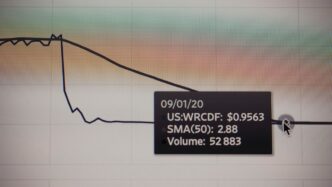
When we talk about temperature changes by 2050, we’re usually looking at data from something called the Coupled Model Intercomparison Project, or CMIP. The specific map you’re seeing might be based on a particular model, like CCSM4, and a scenario called ‘Scenario 8.5’. Think of Scenario 8.5 as a ‘worst-case’ where we don’t really do much to cut down on greenhouse gas emissions. It’s important to remember that the further out you look and the smaller the area you’re interested in, the more uncertainty creeps into these projections. So, while we can get a good idea of broad regional trends, expect some variation at the local level.
Data Analysis and Averaging Techniques
Once the raw data from these climate models is available, it needs to be processed. Often, this involves averaging the temperature changes over specific administrative areas, like countries or provinces. This averaging smooths out some of the natural ups and downs you’d see in the raw data, giving a clearer picture of the overall trend. Tools like ArcGIS Pro are used to handle this kind of spatial data analysis. The data were averaged by administrative boundaries, and sometimes this can lead to abrupt changes between neighboring areas because the natural climate gradients are smoothed out.
Climate Model Intercomparison Project (CMIP) Data
The CMIP project is a big international effort where different research groups run their climate models under various scenarios. It’s a way to compare how different models behave and to get a broader range of possible outcomes. The data used for these maps often comes from the latest iteration, CMIP6, though sometimes older data (like from CMIP5) might still be used for certain projections, like economic impacts. The goal is to get a robust set of projections that scientists can use to study future climate impacts. You can explore how different warming levels affect specific areas using tools that visualize these climate change impacts.
Here’s a quick look at how the data is generally handled:
- Model Selection: Choosing specific climate models and emissions scenarios (like Scenario 8.5).
- Data Processing: Averaging temperature data over defined geographic regions.
- Analysis: Using software to analyze spatial patterns and trends.
- Uncertainty Assessment: Acknowledging that projections have limitations, especially at smaller scales.
Visualizing Future Climate Scenarios
So, we’ve looked at where the data comes from, but what does it actually show us for the future? This is where things get interesting, and honestly, a little concerning. We’re talking about mapping out what the world might look like in 2050 based on different paths we could take.
Scenario 8.5: Unmitigated Emissions Pathway
This scenario, often called the ‘business as usual’ or ‘worst-case’ scenario, basically assumes we don’t do much to curb greenhouse gas emissions. Think of it as continuing on our current trajectory, or even accelerating it. The maps we’re looking at often use this scenario to show the potential temperature increases. It’s a stark reminder of what could happen if we don’t make significant changes. For instance, models using this pathway, like the CCSM4 model, project notable temperature shifts compared to historical averages. These projections are averaged across large areas, but it’s important to remember that local variations can be quite different.
Regional Impact Assessments
It’s not just about a global average temperature rise; the impacts are felt differently everywhere. These visualizations help us see how specific regions might be affected. We’re talking about changes in temperature that could influence everything from agriculture to where people can comfortably live. The data is often broken down by administrative boundaries, giving us a more granular look, though this averaging can smooth out natural temperature gradients that exist in the real world. You can explore some of these detailed climate data sets at ClimateData.ca.
Uncertainty in Projections
Now, nobody has a crystal ball, right? Climate models are complex, and there’s always a degree of uncertainty. This is especially true when you zoom in on smaller areas. The projections are based on sophisticated models like those from the Coupled Model Intercomparison Project (CMIP), but they are still models.
Here’s a quick rundown of why there’s uncertainty:
- Model Differences: Different climate models, even when using the same emissions scenario, can produce slightly different results.
- Natural Variability: The Earth’s climate system has natural ups and downs that are hard to predict perfectly.
- Future Human Actions: The biggest unknown is how much we will actually reduce emissions in the coming years.
These maps are our best guess, based on the science we have today, and they are constantly being refined as our understanding grows and new data becomes available.
Projected Impacts on Human Systems
When we talk about global warming, it’s not just about polar bears and melting ice caps. It’s about how our daily lives, our economies, and even our health will change. By 2050, the way we use energy and the costs associated with it are expected to shift quite a bit.
Energy Consumption Shifts
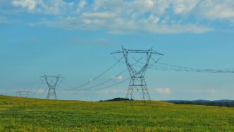
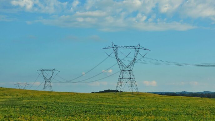
Think about your electricity bill. As temperatures rise, especially in already warm regions, we’ll likely need more power for cooling. Conversely, colder areas might see a slight decrease in heating needs, but the overall trend points towards increased energy demand for climate control. This isn’t just about air conditioning; it affects everything from how businesses operate to how we store food.
- Increased demand for cooling in many populated areas.
- Changes in how industries use energy due to temperature fluctuations.
- Potential strain on existing power grids, especially during heatwaves.
Monetizing Future Energy Costs
These shifts in energy use come with a price tag. Researchers have looked at historical data to figure out how much more or less people spend on energy based on temperature. They’ve broken the world down into small regions, kind of like counties, to get a detailed picture. The projections suggest that by 2050, changes in energy spending due to climate change could represent a noticeable percentage of a region’s economy. This cost isn’t just about the price of electricity or fuel; it’s also about the investments needed to adapt our infrastructure.
| Region Type | Projected Change in Energy Expenditure (% of GDP) |
|---|---|
| Global Average | Varies by scenario, but generally increasing |
| High-Income Regions | Moderate increase, driven by cooling needs |
| Low-Income Regions | Potentially larger increases, less capacity to adapt |
Adaptive Behaviors and Economic Factors
It’s not all doom and gloom, though. As people get wealthier and face warmer climates, they tend to adapt. This could mean investing in more efficient appliances, better building insulation, or even changing work schedules to avoid the hottest parts of the day. However, the ability to adapt isn’t equal everywhere. Developing nations might struggle to afford these changes, potentially widening economic gaps. The models try to account for these adaptive behaviors, but there’s always a degree of uncertainty. Future economic growth and the price of energy also play a big role in how these costs play out.
Assessing Mortality Risks by 2050
When we talk about climate change, it’s not just about polar bears and melting ice caps, right? There’s a very real human cost, and by 2050, that cost could be measured in lives lost due to changing temperatures. Researchers have been digging into massive datasets, looking at millions of death records from all over the world, and connecting them with local weather patterns over many years. What they’re finding is pretty stark: both extreme heat and extreme cold have a noticeable effect on how many people die.
Quantifying Climate Change’s Effect on Death Rates
It turns out, the relationship between temperature and death isn’t the same everywhere. It depends a lot on where you live and how wealthy your community is. For instance, a heatwave that might be manageable in a developed country with good infrastructure could be deadly in a poorer region with less access to cooling or medical care. Scientists are building models to figure out these differences. They’re taking historical data and projecting it forward, looking at how different climate scenarios might play out.
- Extreme heat events are projected to cause more excess deaths globally than extreme cold events by 2050.
- Populations in tropical regions and those with lower adaptive capacity are expected to face higher risks.
- Even with adaptation measures, some increase in temperature-related mortality is anticipated.
Global Mortality Cost Projections
These aren’t just abstract numbers. Researchers are trying to put a price tag on these potential deaths, not to say a life has a specific value, but to understand the economic impact of increased mortality. This involves looking at how much people spend on things that help them cope with heat or cold, like air conditioning or better housing, and also factoring in the broader societal costs. They’re using something called the ‘value of statistical life’ (VSL) to help monetize these risks. It’s a way to quantify the willingness to pay to reduce the risk of death.
| Scenario | Projected Annual Excess Deaths (Millions) | Monetized Cost (Trillions USD) |
|---|---|---|
| Moderate | 1.5 – 2.5 | 1.0 – 2.0 |
| High Emissions | 3.0 – 5.0 | 2.5 – 4.5 |
Note: These are illustrative figures based on general trends and should not be taken as precise predictions.
The Role of Adaptation in Mortality Impacts
Now, it’s not all doom and gloom. People adapt. Communities adapt. As temperatures rise and societies get richer, we tend to invest more in ways to stay cool or warm. This could mean better building codes, more widespread use of cooling technologies, or even changes in work schedules to avoid the hottest parts of the day. These adaptive measures can significantly reduce the number of deaths linked to climate change. However, there’s a limit to how much we can adapt, and the effectiveness of these strategies also varies greatly depending on resources and existing infrastructure. The biggest challenge is ensuring that adaptation strategies are accessible to everyone, especially the most vulnerable populations.
Methodologies for Climate Impact Modeling
So, how do scientists actually figure out what the climate might be like in 2050 and what that means for us? It’s not just a simple guess. They use some pretty involved methods to get these "Global Downscaled Projections for Climate Impacts Research," or GDPCIR as they call it.
Downscaling Climate Model Outputs
Think of the big climate models as giving us a broad picture, like a blurry map of the whole world. Downscaling is like zooming in on that map to get a clearer, more detailed view for specific areas. The GDPCIR dataset uses a technique called Quantile Delta Mapping (QDM). It’s a way to take the general temperature changes predicted by those big models and make them more precise for smaller regions. It also helps make sure that the really hot days and cold snaps, the "extremes," are represented more accurately. They even have another method, Quantile-Preserving Localized-Analog Downscaling (QPLAD), to boost the spatial resolution even further while keeping those extreme weather events in the picture. This process is key to understanding how climate change might affect a specific city or region, not just the planet as a whole.
Probabilistic Ensemble Generation
Climate models don’t all agree perfectly. They’re like a group of experts giving their best guess, and their guesses can vary. To get a better handle on the possibilities, scientists create "ensembles." This means they look at the results from many different climate models. But just having a bunch of models isn’t enough. They need to figure out which models are more likely to be right. They do this by comparing the models’ predictions to a simpler, probabilistic climate model. This helps them assign weights to the different model outputs, giving more importance to those that seem more reliable. They also use "model surrogates" to represent temperature outcomes that might not be covered by the main set of models, adding another layer to capture potential variations.
Bias Correction and Quantile Mapping
Climate models, even the best ones, aren’t perfect. They can have "biases," meaning their predictions might consistently be a bit too high or too low in certain areas or for certain types of weather. Bias correction is like adjusting those predictions to make them more accurate compared to what we’ve actually observed. Quantile mapping, which is part of the QDM method mentioned earlier, is a way to do this. It looks at the distribution of temperatures – how often hot days occur, how often cold days occur – and adjusts the model’s predictions to better match the historical record. This helps ensure that the projected changes in temperature, especially the extreme ones, are more realistic. It’s a multi-step process, but it’s all about refining the data so we can make more informed decisions about the future.
Economic Consequences of a Warming Planet
So, what does all this warming actually mean for our wallets and the global economy? It’s not just about polar bears, unfortunately. Climate change is projected to hit our economies pretty hard by 2050, and it’s not a simple story. We’re talking about changes in how much energy we use, the costs associated with that energy, and even how much people are worth in economic terms when we consider risks.
GDP Impact from Climate Change
Think about it: hotter summers mean more air conditioning, and colder winters (in some places, anyway) mean more heating. This directly affects how much energy we need to buy. Studies have looked at historical data, comparing energy use with temperature changes across many countries. They found that both extreme heat and extreme cold really do make a difference in how much electricity and other fuels we burn. As incomes rise and people adapt, this relationship can change, but the overall trend points to increased energy costs in many regions.
These projected changes in energy spending are then translated into monetary terms. The big picture is that these costs are expected to chip away at our Gross Domestic Product (GDP). Imagine your country’s total economic output – a portion of that will likely be diverted to cover increased energy bills due to climate shifts. It’s like a hidden tax that gets bigger as the planet warms.
Valuing Statistical Life
This one’s a bit grim, but important. When we talk about the economic costs of climate change, we also have to consider the impact on human life. Researchers try to put a monetary value on the risk of death from climate-related factors. This isn’t about putting a price tag on an individual, but rather understanding the societal cost of increased mortality. It’s based on how much people are willing to pay for small reductions in their risk of dying. This ‘value of statistical life’ is then used to estimate the economic burden of climate change’s effects on death rates globally.
Aggregating Regional Economic Damages
Putting all these pieces together is a massive undertaking. Scientists divide the world into thousands of small regions, each with a population similar to a U.S. county. They then calculate the projected economic impacts – like changes in energy costs and mortality risks – for each of these tiny areas. Finally, they add all these regional numbers up to get a global picture. This process helps us see how different parts of the world might be affected and how those local impacts add up to a worldwide economic consequence. It’s a way to visualize the cumulative effect of countless local changes on the global economy.
Here’s a simplified look at how these costs might add up:
- Increased Energy Demand: More cooling in hot regions, more heating in cold regions.
- Higher Energy Bills: Direct costs to households and businesses.
- Economic Drag: A portion of GDP diverted to cover these costs, potentially slowing growth.
- Health Costs: Increased healthcare spending due to climate-related illnesses and mortality.
It’s a complex web, and the exact numbers can vary depending on the climate models and economic scenarios used, but the general direction is clear: warming comes with a significant economic price tag.
Looking Ahead: What the 2050 Map Tells Us
So, we’ve taken a look at what the world might be like temperature-wise in 2050, based on some pretty detailed science. It’s not exactly a crystal ball, but these maps give us a good idea of the general trends. Different places will likely see different amounts of warming, and it’s important to remember that these are just projections. The actual future depends a lot on the choices we make now. Understanding these potential changes helps us think about what we need to do, both globally and in our own communities, to deal with a warmer planet. It’s a big topic, and this map is just one piece of the puzzle, but it’s a piece that really makes you think.
Frequently Asked Questions
What is a global warming prediction map for 2050?
A global warming prediction map for 2050 is a way to see how much warmer different parts of the world might get by the year 2050. It uses computer models to show these expected temperature changes based on different ideas about how much pollution we’ll create.
Where does the information for these maps come from?
The information comes from scientists who use supercomputers to run climate models. These models are based on past weather data and different possibilities for future pollution levels. Different research groups and computer models are used to get a better picture.
What does ‘Scenario 8.5’ mean?
Scenario 8.5 is like a worst-case story. It means we keep polluting the Earth a lot, and the world gets much warmer. Scientists also look at other scenarios where we pollute less, which would lead to smaller temperature increases.
How do these maps help us understand the future?
These maps help us visualize what might happen to temperatures in different places. This can help us understand potential impacts on things like farming, water, and how much energy we might need for cooling or heating.
Are these predictions exact?
No, these are predictions, not exact facts. Climate science has a lot of uncertainty, especially when looking at small areas. The further into the future we look, and the smaller the area, the less certain the predictions become.
What are the main ways scientists study climate change impacts?
Scientists use complex computer programs to study how climate change might affect things like energy use, how much it might cost, and even how it could affect people’s health and how long they live. They also try to figure out how we can adapt to these changes.