

Getting ready for a Tableau job interview can feel like a big task. You know you’ve got the skills, but sometimes explaining them clearly is the tricky part. We’ve put together some common tableau interview questions and answers to help you feel more confident. Think of it as a cheat sheet to help you show off what you know about Tableau, from the basics to some of the more involved stuff. This should give you a good starting point for your preparation.
Key Takeaways
- Tableau is a tool for making data visual and easy to understand, helping businesses make better choices.
- Knowing the difference between dimensions (like categories) and measures (like sales numbers) is key in Tableau.
- Connecting to data, joining different tables, and blending data sources are important steps before you can visualize.
- Creating clear and interactive dashboards with the right charts and filters is what makes Tableau powerful.
- Being able to explain your Tableau work, how it helps the business, and how you’d solve problems is just as important as the technical skills.
Understanding Tableau Fundamentals
Alright, let’s kick things off by getting a solid grip on what Tableau actually is and why it’s become such a big deal in the data world. Think of Tableau as your go-to tool for making sense of all that raw data floating around. It’s not just about making pretty charts, though that’s part of it. Its main job is to help people see and understand information quickly, so they can make better decisions.
What Is Tableau And Its Core Purpose?
At its heart, Tableau is a business intelligence platform. It lets you connect to all sorts of data, from simple spreadsheets to complex databases, and then turn that data into visual stories. The "drag-and-drop" interface is a big part of its appeal. You don’t need to be a coding wizard to start exploring your data. This makes it accessible to a lot of different people in a company, not just the tech folks. The goal is to make data analysis faster and more intuitive, allowing users to discover insights they might otherwise miss. It’s about democratizing data, so more people can use it to do their jobs better.
Key Differences Between Tableau And Other BI Tools
So, how does Tableau stack up against other tools out there? Well, a few things make it stand out. For starters, its focus on visual analytics is pretty strong. While other tools might offer similar features, Tableau often feels more fluid and interactive when you’re actually exploring the data. It’s also known for its ability to connect to a wide range of data sources, from cloud-based services to on-premises databases, without a ton of fuss. Another point is its ease of use; many users find it quicker to get up and running with Tableau compared to some other, more technical BI solutions. This user-friendliness is a big reason why it’s popular in many businesses. You can find a good overview of these differences in this resource.
Dimensions Versus Measures In Tableau
This is a really important distinction to get right when you’re working in Tableau. Basically, you’ve got two main types of data fields: Dimensions and Measures.
- Dimensions: These are usually qualitative or categorical data. Think of things like customer names, product categories, dates, or regions. When you drag a dimension onto a view, Tableau typically groups the data by that category. They define the level of detail in your analysis.
- Measures: These are the quantitative, numerical values you want to measure or aggregate. Examples include sales figures, profit amounts, quantities, or temperatures. When you drag a measure into a view, Tableau usually performs an aggregation, like summing or averaging the values.
Here’s a quick way to think about it:
| Data Type | Examples | Tableau Role |
|---|---|---|
| Dimension | Product Name, Region, Order Date | Defines categories, groups, or segments |
| Measure | Sales, Profit, Quantity, Discount | Provides numerical values for aggregation |
Understanding this difference is key to building accurate and meaningful visualizations. It dictates how Tableau will process and display your data.
Mastering Data Connections And Preparation
Getting your data into Tableau is the first real step, and honestly, it’s where a lot of projects can either take off or get bogged down. You’ve got to know how to connect to different places your data lives and make sure it’s clean enough to actually use. It’s not just about clicking a button; it’s about understanding what’s happening under the hood.
Connecting To Various Data Sources
Tableau is pretty flexible when it comes to where your data comes from. You’re not stuck with just one type of file or database. Knowing how to connect to a wide range of sources is key to bringing all your information together. Think about it: your sales data might be in a SQL database, your marketing campaign info in a Google Sheet, and customer feedback in a CSV file. Tableau can handle all of that.
Here are some common places Tableau can connect to:
- Files: This includes things like Excel spreadsheets, CSV files, text files, and even PDFs.
- Relational Databases: You’ll often connect to databases like SQL Server, Oracle, MySQL, PostgreSQL, and others.
- Cloud Data Warehouses: Platforms like Snowflake, Amazon Redshift, and Google BigQuery are also common connection points.
- Web Connectors: Tableau can pull data from web services and online applications.
When you connect, you usually have two main options: a live connection or an extract. A live connection means Tableau queries your data source directly every time you interact with a viz. An extract, on the other hand, is a snapshot of your data saved within Tableau, often in a .hyper format. Extracts are generally faster for analysis, especially with large datasets, but they don’t update in real-time unless you schedule refreshes. Choosing the right connection type really depends on your data volume, how fresh the data needs to be, and performance needs. You can find more details on Tableau’s data connection options.
Understanding Different Join Types In Tableau
Once you’ve got your data sources connected, you often need to combine them. This is where joins come in. Joins are like putting puzzle pieces together, matching rows from one table to another based on common fields. Picking the wrong join can lead to missing data or incorrect calculations, which is a big problem.
Tableau visually represents joins in the Data pane, making it easier to see how your tables are related. Here are the main types:
- Inner Join: This is the most common. It only keeps rows where the join key exists in both tables. So, if you join customer data to order data, you’ll only see customers who have actually placed an order.
- Left Join: This keeps all rows from the left table and only the matching rows from the right table. If a customer has no orders, they’ll still show up in the results, but the order details will be blank.
- Right Join: This is the opposite of a left join. It keeps all rows from the right table and matching rows from the left.
- Full Outer Join: This keeps all rows from both tables. If there’s a match, it combines them. If there isn’t a match in one of the tables, it fills the missing side with null values. This is useful for finding discrepancies or ensuring you have a complete picture.
Choosing the right join depends entirely on the question you’re trying to answer. For instance, if you want to see all products and their sales, you’d use a left join from products to sales. If you only want to see products that have been sold, an inner join would work.
The Concept And Application Of Data Blending
Data blending is a bit different from joining. While joins combine data at the row level before it gets to Tableau (usually within a single data source or database), blending happens within Tableau, after the data has already been brought in from different sources. It’s like bringing together separate reports on your desk and comparing them, rather than merging them into one giant report first.
Here’s how it generally works:
- Connect to your data sources: You connect to each data source independently.
- Start building a visualization: You drag fields from one source onto your sheet. This becomes the ‘primary’ data source.
- Link to another source: You then go to the Data menu and select ‘Edit Relationships’ or click on a field from a secondary source. Tableau looks for common fields (dimensions) between the sources.
- Tableau links them: When you add fields from the secondary source to your viz, Tableau aggregates each source separately and then combines the results based on the linked dimensions. You’ll see a little orange link icon next to the linking field in the Data pane.
Data blending is super handy when you can’t physically join your data sources, maybe because they’re from different databases or have different levels of detail. For example, you might blend website traffic data (from Google Analytics) with sales data (from your CRM) using a common field like ‘Date’. This lets you see how website visits correlate with actual sales without needing a complex data warehouse setup. It’s a powerful way to get insights when direct joins aren’t feasible.
Building Effective Visualizations And Dashboards
Alright, so you’ve wrangled your data and you’re ready to make it look good. This is where Tableau really shines, turning raw numbers into something people can actually understand. It’s not just about pretty charts; it’s about telling a story with your data.
Creating And Utilizing Calculated Fields
Calculated fields are like your secret weapon in Tableau. They let you create new data points from what you already have. Think of it as doing math or manipulating text right inside Tableau, without needing to go back to the source data. You can make simple things like adding two numbers together, or more complex stuff like figuring out profit margins or categorizing customers based on their spending.
- Profit Margin Calculation:
SUM([Sales] - SUM([Cost])) / SUM([Sales])This shows you how much profit you’re making relative to your sales. - Customer Segmentation: You could create a field that labels customers as ‘High Value’, ‘Medium Value’, or ‘Low Value’ based on their total purchase amount.
- Date Calculations: Finding the difference between two dates, or calculating the day of the week, can be super useful for trend analysis.
The real power comes when you use these calculated fields in your visualizations. They become new dimensions or measures you can drag and drop just like your original data.
The Role And Types Of Filters In Tableau
Filters are how you narrow down your data to show only what’s relevant. Imagine you have sales data for the whole country, but you only want to see what happened in California last quarter. That’s where filters come in. They help make your dashboards focused and prevent information overload.
There are a few main types:
- Extract Filters: These are applied when you create a Tableau extract. They reduce the amount of data brought into the extract, which can speed things up.
- Data Source Filters: These apply to the entire data source connection. Everyone using that connection will see the filtered data.
- Context Filters: These are a bit special. They’re applied before other filters (except extract filters). Think of them as setting the stage for your other filters. They’re great for performance when you have complex calculations or many filters.
- Dimension Filters: These are the most common. You drag a field to the Filters shelf, and then choose what values you want to include or exclude.
- Measure Filters: These let you filter based on the value of a measure, like showing only sales above $1000.
- Cascading Filters: This is a neat trick where one filter’s options change based on what’s selected in another. For example, if you select ‘USA’ in a Country filter, the State filter might then only show states within the USA.
Using filters effectively means your audience can easily explore the data themselves, finding the answers they need without getting lost.
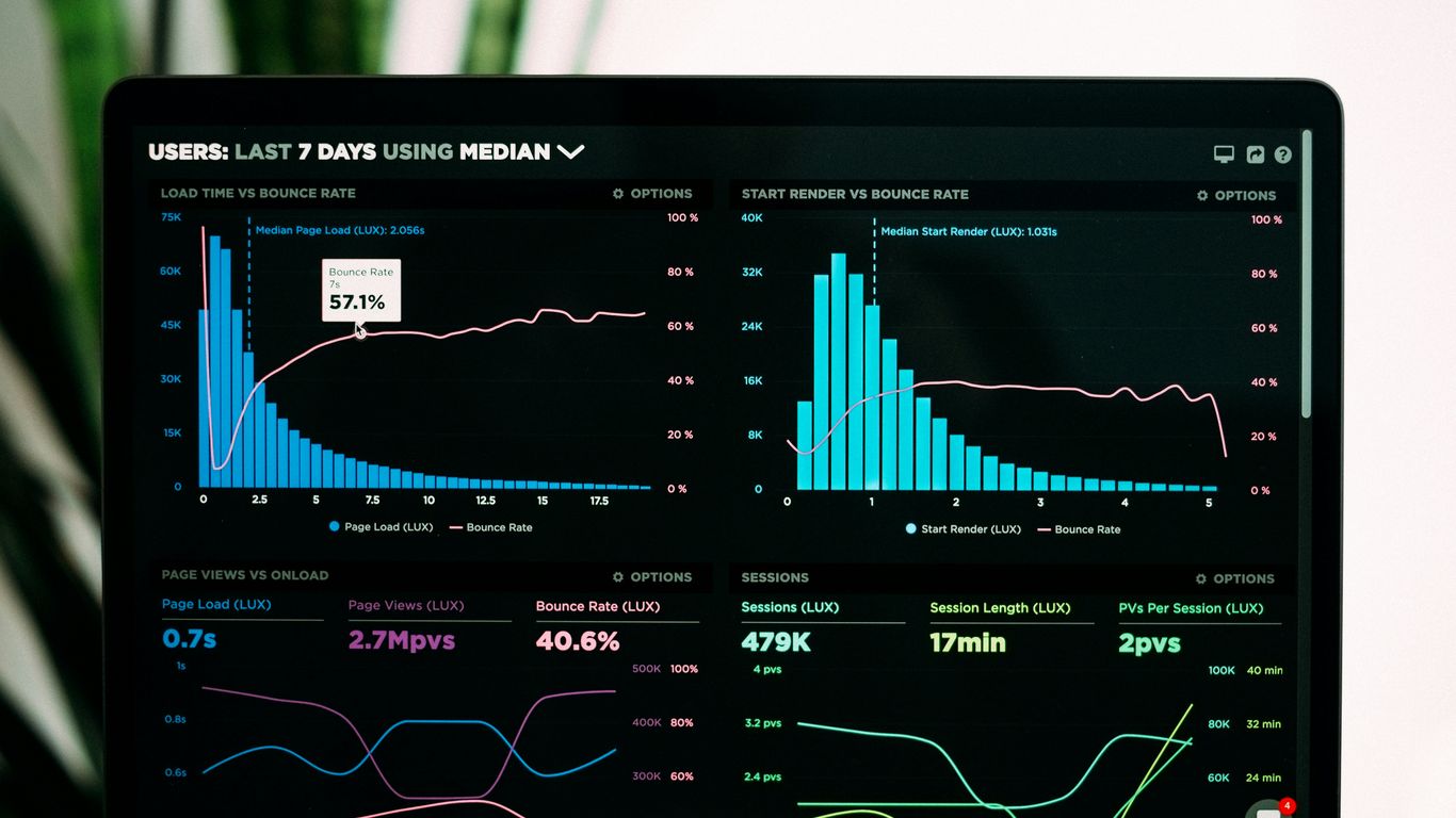
Constructing Interactive Dashboards
A dashboard is basically a collection of worksheets that work together. But just putting charts side-by-side isn’t enough. Interactivity is key. This means making it so users can click on something in one chart and have it affect another chart.
Think about a sales dashboard. You might have:
- A map showing sales by region.
- A bar chart showing sales by product category.
- A line chart showing sales trends over time.
If you click on ‘California’ on the map, you’d want the bar chart and line chart to update to show only California’s sales. That’s interactivity. You can achieve this using Dashboard Actions in Tableau. These actions can filter, highlight, or even navigate to other dashboards based on user selections.
Good dashboard design also means thinking about layout, color, and making sure the most important information is easy to find. It’s about guiding the user through the data.
Creating Advanced Chart Types Like Heat Maps And Treemaps
Sometimes, standard charts like bar or line charts just don’t cut it. That’s when you bring out the heavy hitters like heat maps and treemaps.
A Heat Map uses color intensity to show the magnitude of a value across two dimensions. Imagine a grid where each cell’s color tells you something. For example, you could have days of the week on one axis and hours of the day on the other, with the color of each cell showing website traffic. Darker colors mean more traffic.
A Treemap is great for showing hierarchical data and proportions. It uses nested rectangles, where the size of each rectangle represents one measure (like sales), and the color can represent another measure (like profit). They’re really good for seeing how different parts contribute to a whole, especially when you have many categories.
For instance, you could use a treemap to show sales across different product categories and sub-categories. The biggest rectangles would be your top-selling categories, and you could color-code them by profit margin to quickly see which ones are most profitable. It’s a very space-efficient way to visualize a lot of data at once.
Advanced Tableau Techniques And Scenarios
Alright, so you’ve got the basics down, you can whip up a chart like nobody’s business, and your dashboards are looking pretty slick. But what happens when things get a bit more complicated? That’s where these advanced techniques come in. They’re the kind of things that separate the good Tableau users from the great ones, and interviewers love to ask about them.
Leveraging Parameters For Dynamic Analysis
Parameters are super handy for letting users tweak things on the fly. Think of them as placeholders that can change the values used in calculations, filters, or even reference lines. For instance, you could set up a parameter for a sales target. Then, you can create a calculated field that compares actual sales to this target, and the user can simply change the target value in the parameter control without you having to rebuild the whole worksheet. It makes your dashboards way more interactive and useful for quick "what-if" scenarios. This ability to create dynamic, user-driven analysis is a big plus.
Implementing Row-Level Security
Security is a big deal, right? You don’t want everyone seeing everything. Row-level security (RLS) in Tableau lets you control which rows of data a user can see based on their login. This is usually done with a calculated field that checks the user’s name or role against a data source that maps users to specific data subsets. For example, a sales manager for the West region should only see sales data for the West. It’s a bit tricky to set up, often involving a separate user filter table, but it’s really important for keeping sensitive information safe. It’s a common topic in interview questions for Tableau roles.
Troubleshooting Data Connection Issues
Sometimes, your data just won’t connect, or it’s acting weird. This is where your detective skills come in. You might be looking at:
- Incorrect credentials: Double-check usernames and passwords.
- Firewall blocks: Network issues can prevent Tableau from reaching the data source.
- Driver problems: Ensure you have the right drivers installed for your specific database.
- Data source changes: If the database structure changed, your connection might break.
- Live vs. Extract issues: Sometimes a live connection is slow, or an extract is out of date.
Being able to calmly diagnose and fix these problems shows you can keep the analysis flowing even when things go wrong.
Optimizing Performance With Large Datasets
Working with huge amounts of data can make Tableau crawl. Nobody likes waiting ages for a dashboard to load. The first thing to consider is using Tableau Extracts instead of live connections when possible. Extracts are optimized for performance. You can also
- Reduce the number of fields: Only bring in the data you actually need.
- Use context filters: These are applied before other filters and can speed things up.
- Aggregate data: If you don’t need every single row, summarize it first.
- Optimize calculations: Avoid overly complex or inefficient calculations, especially Level of Detail (LOD) expressions, if simpler alternatives exist.
Sometimes, just asking if you really need row-level detail can save a lot of headaches. For instance, if you’re looking at yearly sales, you probably don’t need every single transaction from the last decade. Aggregating to a higher level can make a massive difference.
Data Storytelling And Business Impact
So, you’ve built some pretty charts and maybe even a dashboard or two. That’s great! But the real magic happens when you can take that data and turn it into a story that makes sense to people, especially those who aren’t glued to spreadsheets all day. It’s about showing them what the numbers mean for the business.
Explaining The Purpose Of A Dashboard
A dashboard isn’t just a collection of charts thrown together. Think of it more like a control panel for your business. Its main job is to give a quick, at-a-glance view of what’s important. You want to see the key performance indicators (KPIs) right away, without having to dig around. It should answer the big questions immediately. For instance, a sales dashboard might show total revenue, sales by region, and top-selling products. The goal is to make complex information simple and actionable. A good dashboard tells you what’s happening, why it’s happening, and what you might need to do about it.
Creating A Data Story In Tableau
Tableau Stories are a fantastic way to guide your audience through a narrative. Instead of just presenting a static report, you create a sequence of views, like slides in a presentation. Each ‘story point’ focuses on a specific insight or a step in your analysis. You can add text and annotations to explain what the viewer is seeing and why it matters. For example, you might start with an overview of sales performance, then drill down into a specific region that’s underperforming, show the contributing factors, and finally, present a proposed solution or a positive trend.
Here’s a basic flow:
- Set the Scene: Start with a high-level view of the situation.
- Identify the Issue/Opportunity: Highlight a specific problem or area for growth.
- Explore the ‘Why’: Use different visualizations to show the root causes or drivers.
- Propose Action/Solution: Suggest what steps can be taken.
- Show the Outcome/Projection: Display the expected results or a positive trend.
Utilizing Trend Lines And Forecasting
Sometimes, just looking at past data isn’t enough. You need to see where things are headed. That’s where trend lines and forecasting come in. Trend lines help you see the general direction of your data over time – is it going up, down, or staying flat? Tableau can automatically add these lines to your charts. Forecasting takes it a step further. It uses statistical models to predict future values based on historical patterns. This can be super helpful for planning inventory, staffing, or marketing campaigns. For example, if you see a consistent upward trend in website traffic, forecasting can give you an idea of how many visitors to expect next month, helping you prepare your server capacity or ad spend.
Wrapping Up Your Tableau Prep
So, we’ve gone through a bunch of common questions you might face when interviewing for a Tableau role. It can feel like a lot, but honestly, the best way to get ready is just to practice. Think about how you’d explain things, maybe even try talking through your answers out loud. Having a good handle on these topics will definitely make you feel more comfortable and ready to show what you know. Good luck with your next interview – you’ve got this!
Frequently Asked Questions
What is Tableau and why is it used?
Tableau is like a super-smart tool that helps people understand information by turning boring numbers into colorful pictures. Imagine you have a big pile of toys, and you want to know which color is the most popular. Tableau can quickly sort through the pile and show you a bright, easy-to-see chart that tells you exactly that. Businesses use it to make better choices by seeing patterns in their sales, customers, or anything else they track.
What’s the difference between ‘Dimensions’ and ‘Measures’ in Tableau?
Think of ‘Dimensions’ as the categories or labels you use to group your data, like names, dates, or product types. ‘Measures’ are the numbers you want to count or average, like sales amounts, quantities, or scores. So, you might look at the ‘Sales’ (Measure) for each ‘Product Category’ (Dimension).
How do you connect Tableau to your data?
Connecting to data is like telling Tableau where to find the information. You can connect to many places, like files on your computer (like Excel sheets), or big databases that many people use. You just click ‘Connect to Data,’ choose where your information lives, and Tableau will guide you through the steps to bring it in.
What are calculated fields and when would you use them?
Calculated fields are like making your own special columns of data. If Tableau doesn’t have exactly what you need, you can create a new piece of information. For example, if you have ‘Price’ and ‘Quantity,’ you can create a ‘Total Sales’ calculated field by multiplying them. It’s like doing a math problem within Tableau.
What is a dashboard in Tableau?
A dashboard is like a control panel for your data. Instead of looking at many separate charts, you can put the most important ones all on one screen. This helps you see the big picture quickly and understand how different pieces of information relate to each other. It’s great for making fast decisions.
How can you make your Tableau dashboards interactive?
Making dashboards interactive means letting the person looking at them play around with the data. You can add things like filters, so they can choose to see data for just one region or one product. You can also set up actions, so clicking on one chart changes what another chart shows. This makes exploring the data much more engaging and helpful.