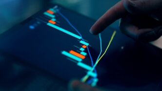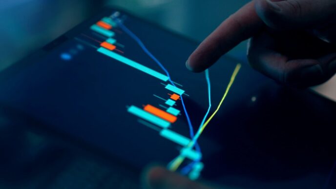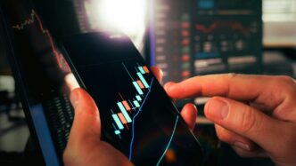
Ever wondered how some folks seem to know what crypto is going to do next? While nobody has a crystal ball, understanding a crypto money flow chart can give you a real edge. It’s not as scary as it looks, promise. This guide will help you get a handle on reading these charts, so you can start making smarter choices in the crypto world.
Key Takeaways
- A crypto money flow chart shows you how money moves in and out of different digital coins.
- Candlestick patterns are like little stories on the chart, telling you about price changes.
- Spotting common chart shapes can give you clues about where prices might go.
- Different market indicators help you see things like how much something is being traded or how fast its price is changing.
- Using these tools helps you make better trading plans and manage your risks.
Decoding the Crypto Money Flow Chart

Understanding how money moves in the crypto world is a big step for anyone looking to get involved. It’s not just about buying and selling; it’s about seeing the bigger picture of market activity. Learning to read these charts helps you make smarter choices about when to act. Think of it like reading a map before a long trip. You wouldn’t just drive aimlessly, right? Same idea here. These charts show you where the market has been and give clues about where it might go next. It’s all about spotting patterns and understanding what they mean.
Understanding Chart Components
Crypto money flow charts are made up of several parts, and each one tells a piece of the story. Getting familiar with these components is the first step to making sense of the whole thing. It’s like learning the alphabet before you can read a book.
- Price Axis: This is usually on the right side of the chart and shows the price of the cryptocurrency. It goes up and down as the price changes.
- Time Axis: Located at the bottom, this axis shows the time period being displayed. You can often adjust this to see different timeframes, like minutes, hours, or days.
- Volume Bars: These are typically at the bottom of the chart and show how much of the cryptocurrency was traded during a specific time period. Higher bars mean more trading activity.
- Candlesticks: These are the main visual elements, showing price movement over a set time. Each candlestick represents the open, close, high, and low prices for that period.
Interpreting Price Movements
Once you know the parts, the next step is to understand what the price movements on the chart are actually telling you. It’s not just random lines; there’s a story unfolding.
- Uptrends: When prices are generally moving upwards over time, it’s called an uptrend. This often suggests growing interest and demand for the crypto.
- Downtrends: The opposite of an uptrend, where prices are consistently moving lower. This can indicate selling pressure or a decrease in demand.
- Sideways Movement: Sometimes, prices don’t go clearly up or down but stay within a relatively narrow range. This can mean the market is undecided or consolidating before a bigger move.
- Volatility: This refers to how much the price swings up and down. High volatility means big price changes, while low volatility means more stable prices.
The Role of Technical Analysis
Technical analysis is basically the study of past market data, mainly price and volume, to try and predict future price movements. It’s not a crystal ball, but it gives you tools to make educated guesses. Many traders use it to find good entry and exit points. For example, understanding Dogelend investment opportunities often involves looking at its past performance through technical analysis.
Here’s a simple breakdown of what technical analysis involves:
- Chart Patterns: Recognizing specific shapes or formations on the chart that have historically led to certain price outcomes.
- Indicators: Using mathematical calculations based on price and volume data to generate signals about market conditions, like momentum or overbought/oversold levels.
- Support and Resistance: Identifying price levels where buying or selling pressure is expected to be strong, potentially stopping or reversing a price trend.
It’s about looking at the data and trying to find clues. It takes practice, but it’s a skill that can really help you navigate the crypto market.
Mastering Candlestick Patterns for Crypto Money Flow

Anatomy of a Candlestick
When you look at a crypto chart, you’ll notice these distinct shapes called candlesticks. Each one tells a story about price action over a specific time period. Think of it like a mini-summary of what happened to the price. A candlestick has two main parts: the body and the wicks (sometimes called shadows). The body is the thicker part, and it shows you the opening and closing prices for that period. If the body is green (or sometimes white), it means the closing price was higher than the opening price – a price increase. If it’s red (or sometimes black), the closing price was lower than the opening price – a price decrease. The wicks are the thin lines extending from the top and bottom of the body. These show the highest and lowest prices reached during that same period. So, the top of the upper wick is the highest price, and the bottom of the lower wick is the lowest price. Understanding these basic components is the first step to reading crypto charts effectively.
Bullish and Bearish Indicators
Candlesticks aren’t just pretty shapes; they’re packed with information that can hint at future price movements. Certain patterns formed by one or more candlesticks are considered
Key Chart Patterns in Crypto Money Flow Analysis
When you zoom out from individual candlesticks, you start to see bigger pictures forming on crypto charts. These larger formations, often called chart patterns, can give you some ideas about where prices might be headed. It’s not about predicting the future exactly, but more about understanding possibilities. Think of it like looking at cloud formations – you might see a shape that reminds you of something, and that shape could suggest rain, but it’s not a guarantee.
Recognizing Head and Shoulders Formations
One of the more well-known chart patterns is the "head and shoulders." This one shows up as three peaks or valleys next to each other. The middle peak or valley, the "head," is usually taller or deeper than the two on either side, which are the "shoulders."
- A bullish head and shoulders pattern, often seen after a downtrend, looks like three valleys, with the middle one being the lowest. This can suggest that the price might be getting ready for an upward move.
- On the flip side, a bearish head and shoulders pattern, which you might see after an uptrend, has three peaks, with the middle one being the highest. This kind of pattern can sometimes mean that a price drop is coming. It’s like the market is running out of steam after a climb.
Identifying Wedge Patterns
Wedge patterns are another interesting formation to keep an eye on. You can spot these by drawing two trend lines that connect the highs and lows of the price movement. When these two lines start to get closer together, forming a wedge shape, you’ve found one.
- A bullish wedge, also known as a falling wedge, has both trend lines sloping downwards, but they’re converging. This pattern often appears during a downtrend and can signal that the selling pressure is easing, potentially leading to a price reversal upwards.
- A bearish wedge, or a rising wedge, has both trend lines sloping upwards, but they’re also converging. This usually shows up during an uptrend and might suggest that the upward momentum is slowing down, possibly leading to a price correction downwards.
- It’s important to remember that the breakout from a wedge, either up or down, is what often confirms the pattern’s implications.
Other Common Chart Signals
Beyond head and shoulders and wedges, there are other patterns that traders often look at. These include things like triangles (symmetrical, ascending, and descending), flags, and pennants. Each of these has its own characteristics and potential implications for price movement.
- Triangles: These form when price action gets tighter, creating a triangular shape. Ascending triangles often suggest a potential breakout to the upside, while descending triangles might point to a downside breakout. Symmetrical triangles can break either way.
- Flags and Pennants: These are shorter-term patterns that usually appear after a sharp price move. They look like small rectangles (flags) or small triangles (pennants) and often suggest a continuation of the previous trend after a brief pause.
- Double Tops and Bottoms: These patterns indicate a reversal. A double top looks like two peaks at roughly the same level, suggesting a potential downtrend. A double bottom looks like two valleys at roughly the same level, hinting at a possible uptrend.
Understanding these chart patterns can be a useful tool for crypto traders in 2025 trying to make sense of market movements. However, no single pattern guarantees a specific outcome, and it’s always a good idea to use them in combination with other analysis methods.
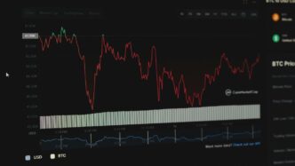
Essential Crypto Market Indicators
When you’re looking at crypto charts, it’s not just about the price going up or down. There are other tools, called indicators, that can give you a better idea of what’s really happening. Think of them like different lenses you can use to see the market more clearly. These indicators help you figure out if a price move is strong or weak, if a trend is likely to continue, or if things are about to change. It’s like having a weather forecast for the market, helping you prepare for what might come next. Understanding these can really change how you approach trading.
Volume-Based Indicators
Volume is pretty straightforward: it’s the number of coins traded over a certain period. But it’s not just a number; it tells you about the conviction behind price moves. High volume on a price increase suggests strong buying interest, while low volume on a price drop might mean less selling pressure. Volume-based indicators help confirm the strength or weakness of price trends. If a big price jump happens on low volume, it might not be sustainable. Conversely, a small price move on huge volume could signal a significant shift brewing.
Here are a few common volume-based indicators:
- On-Balance Volume (OBV): This indicator adds or subtracts total volume based on whether the price closed higher or lower than the previous period. It’s a cumulative total, so a rising OBV suggests buying pressure, while a falling OBV indicates selling pressure. It can sometimes show divergence with price, hinting at a reversal.
- Accumulation/Distribution Line (A/D Line): Similar to OBV, the A/D line uses the closing price’s position within the trading range to determine if accumulation (buying) or distribution (selling) is happening. It helps confirm price trends and can also signal divergences.
- Volume Profile: This shows the total volume traded at specific price levels over a given period. It helps identify areas of strong support and resistance where a lot of trading activity occurred. This can be really useful for understanding where buyers and sellers have previously agreed on value.
Momentum Indicators
Momentum indicators measure the speed and strength of price changes. They don’t tell you the price itself, but how fast it’s moving and if that movement is gaining or losing steam. They are often used to identify overbought or oversold conditions, which can precede price reversals. It’s like checking the speedometer on a car; you know how fast it’s going, not just where it is.
Some popular momentum indicators include:
- Relative Strength Index (RSI): This oscillates between 0 and 100. Readings above 70 usually mean an asset is overbought, suggesting a potential pullback. Readings below 30 often indicate an oversold condition, hinting at a possible bounce. It’s a good way to spot when a price move might be getting tired.
- Moving Average Convergence Divergence (MACD): The MACD shows the relationship between two moving averages of an asset’s price. It has a MACD line, a signal line, and a histogram. Crossovers of the MACD line and signal line can indicate buy or sell signals. Divergences between the MACD and price can also suggest trend reversals. For example, if the price makes a higher high but the MACD makes a lower high, it might mean the upward momentum is weakening.
- Stochastic Oscillator: This indicator compares a specific closing price of an asset to its price range over a period of time. It also ranges from 0 to 100, with readings above 80 indicating overbought conditions and below 20 indicating oversold conditions. It’s often used in conjunction with other indicators to confirm signals.
Volatility Indicators
Volatility indicators measure how much the price of an asset fluctuates over time. High volatility means big price swings, while low volatility means prices are relatively stable. Understanding volatility is important for managing risk and choosing appropriate trading strategies. You wouldn’t trade a calm market the same way you’d trade a wild one.
Here are some common volatility indicators:
- Bollinger Bands: These consist of a middle band (a simple moving average) and two outer bands that are standard deviations away from the middle band. When the bands are wide, it means high volatility. When they are narrow, volatility is low. Price often tends to revert to the middle band, and touches of the outer bands can signal overbought or oversold conditions. A squeeze in the bands often precedes a significant price move.
- Average True Range (ATR): The ATR measures market volatility by calculating the average of true ranges over a specified period. A higher ATR indicates higher volatility, and a lower ATR indicates lower volatility. It’s often used to set stop-loss orders, as it gives you an idea of the typical price movement.
- Keltner Channels: Similar to Bollinger Bands, Keltner Channels use an Average True Range (ATR) to set their upper and lower bands around a moving average. They are often used to identify trend direction and potential breakouts. Price movements outside the channels can indicate strong trends, while a return to the channel might suggest a weakening of that trend. For more insights into market trends, consider exploring on-chain indicators.
Using these indicators together, rather than in isolation, can give you a much clearer picture of the crypto market. No single indicator is perfect, but combining them can help you make more informed decisions and better manage your risk.
Applying Technical Analysis to Crypto Money Flow
Technical analysis is a big part of understanding crypto money flow. It’s not about predicting the future, but more about figuring out what might happen next based on past price action and volume. It gives you a framework to make decisions, which is pretty important in a market that moves as fast as crypto.
Developing Trading Strategies
When you’re looking at crypto charts, you’re trying to find patterns and signals that can help you decide when to buy or sell. This is where developing a trading strategy comes in. It’s basically a set of rules you follow. For example, some people might only buy when a certain indicator crosses above another, or when the price breaks out of a specific chart pattern. Having a clear strategy helps you avoid making emotional decisions, which can be a real problem in crypto trading.
Here are some common elements people use to build their strategies:
- Trend Following: This means you try to identify the direction of the market (up, down, or sideways) and trade in that direction. If the market is going up, you look for buying opportunities. If it’s going down, you might look to sell or short.
- Mean Reversion: This strategy assumes that prices will eventually return to their average. So, if a price has moved too far from its average, you might bet on it coming back.
- Breakout Trading: This involves waiting for the price to move outside of a defined range or pattern. The idea is that once it breaks out, it will continue to move in that direction.
- Scalping: This is a very short-term strategy where traders try to make small profits from small price movements, often within minutes or even seconds.
Risk Management with Indicators
Using indicators isn’t just about finding entry and exit points; it’s also a huge part of managing your risk. Think about it: if an indicator tells you a coin is really overbought, maybe you shouldn’t be buying more, even if you feel like you’re missing out. Indicators can give you a more objective view of the market’s health. For example, the Relative Strength Index (RSI) can tell you if an asset is overbought or oversold. If the RSI is really high, it might be a good time to consider taking some profits or at least tightening your stop-loss.
Here’s how indicators help with risk:
- Identifying Overbought/Oversold Conditions: Indicators like RSI or Stochastic Oscillator can show you when an asset’s price has moved too far, too fast, suggesting a potential reversal. This helps you avoid buying at the top or selling at the bottom.
- Confirming Trends: Moving Averages can confirm the direction of a trend. If the price is consistently above a certain moving average, it suggests an uptrend. If it falls below, it might signal a downtrend, prompting you to adjust your position or exit.
- Setting Stop-Loss Levels: Some indicators can help you place your stop-loss orders more effectively. For instance, you might place a stop-loss below a key support level identified by a chart pattern or a moving average.
The Importance of Due Diligence
Look, technical analysis is a tool, not a crystal ball. You can’t just blindly follow every signal. You’ve got to do your own research, or "due diligence" as they say. This means understanding what you’re trading, why it’s moving, and what external factors might be at play. For example, a great technical setup might be completely ruined by a sudden regulatory announcement. So, while you’re looking at crypto charts easily, also keep an eye on the news and the overall market sentiment. Don’t just rely on one thing. It’s about putting all the pieces together to get the clearest picture you can. Always question, always learn, and always be prepared for things to go differently than you expect.
Navigating Crypto Money Flow with Confidence
Making Informed Decisions
Making good choices in the crypto market means you have to look at a lot of things. It’s not just about seeing a chart go up or down. You need to think about what’s happening in the world, what news is out there, and how that might affect prices. Understanding the bigger picture helps you make smarter moves. It’s like putting together a puzzle; each piece of information helps you see the full image. You can’t just rely on one indicator or one chart pattern. It’s about combining everything you’ve learned.
- Look at market sentiment: Are people generally feeling good or bad about crypto right now?
- Consider global events: Wars, economic changes, or new regulations can all shake things up.
- Check project fundamentals: Is the crypto project itself strong, or is it just hype?
Avoiding Common Pitfalls
It’s easy to make mistakes when you’re new to crypto. One big one is getting too emotional. When prices shoot up, you might feel like you’re missing out and buy in at the top. When they crash, you might panic and sell everything. Both can lead to losses. Another trap is chasing every new coin that pops up. Not every new thing is a good investment. It’s better to stick to what you understand and have researched. Also, don’t put all your money into one thing. Spread it around a bit. This is called diversification, and it helps reduce risk.
Continuous Learning and Adaptation
The crypto world changes fast. What worked yesterday might not work today. New technologies, new regulations, and new trends pop up all the time. So, you have to keep learning. Read articles, watch videos, and follow reliable sources. Don’t just learn about blockchain vs cryptocurrency once and think you’re done. The market is always evolving, and so should your knowledge. Being able to adjust your strategies based on new information is key to staying ahead. It’s a marathon, not a sprint, and the finish line keeps moving.
Wrapping It Up
So, that’s the basic rundown on crypto money flow charts. It might seem like a lot at first, with all the lines and colors, but honestly, it gets easier. Just remember, these charts are like a map, not a crystal ball. They show you what happened and give you some ideas about what might happen next, but nobody can really predict the future. Keep practicing, look at different charts, and you’ll start to get the hang of it. It’s all about learning as you go.
Frequently Asked Questions
What exactly are crypto money flow charts?
Crypto money flow charts are like maps that show you how cryptocurrency prices are moving. They help you see if a crypto’s price is going up, down, or staying the same, and how much is being bought and sold.
What is ‘technical analysis’ in simple terms?
Technical analysis is like being a detective for crypto charts. You look at past price movements and patterns to guess what might happen next. It’s not a crystal ball, but it helps you make smarter choices.
What do the ‘candlesticks’ on a chart mean?
Candlesticks are the main building blocks of these charts. Each one tells you the highest, lowest, opening, and closing price of a crypto for a certain time period, like an hour or a day. Green usually means the price went up, and red means it went down.
Are there special patterns I should look for on these charts?
Chart patterns are like secret codes hidden in the price movements. Things like ‘head and shoulders’ or ‘wedges’ can give you clues about whether a price might go up or down. But remember, they’re just clues, not guarantees!
What are ‘market indicators’ and how do they help?
Market indicators are tools that help you understand what’s happening. Some show how much crypto is being traded (volume), others show how fast the price is changing (momentum), and some tell you how much the price is jumping around (volatility).
How can I use these charts to make good decisions?
The best way is to start small, learn how to read the charts, and always be careful with your money. Don’t put all your eggs in one basket, and keep learning as the crypto world changes. It’s like learning to ride a bike – practice makes perfect!