
It feels like every day there’s a new headline about cyberattacks, and honestly, it can be a lot to keep up with. But what if you could actually see what’s happening out there, in real time? That’s where cyber attack maps come in handy. These tools show us a picture of global cyber threats as they’re happening, giving us a better idea of the kinds of dangers we’re up against. We’ll look at what these maps show, how they work, and why they’re useful, even with their limits.
Key Takeaways
- Cyber attack maps offer a visual way to see global cyber threats as they happen, helping people understand what’s going on.
- These maps can show us current attack patterns and where threats are coming from around the world.
- Using these maps can help teams get more aware of cyber dangers and work together better on security.
- There are different kinds of maps, like those showing live events, past trends, or specific types of attacks.
- While useful, these maps don’t show everything and sometimes the data might not be perfectly accurate or up-to-date.
Understanding the Live Cyber Attack Map
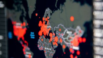
Imagine being able to see cyber threats as they happen, all over the world. That’s essentially what a live cyber attack map does. These tools take a lot of complex data about online security events and turn it into a visual display, usually a map with flashing lights or moving lines. It’s pretty captivating to watch, honestly. You can see where attacks are originating and where they might be heading.
Visualizing Global Cyber Threats in Real-Time
These maps aim to show you what’s going on in the digital world right now. They pull information from different places, like security systems that detect break-in attempts or special networks designed to attract hackers. Think of it as a live news feed, but for cyberattacks. It’s not always perfectly up-to-the-minute, as collecting and processing the data takes a little time, so there might be a slight delay. Still, it gives you a good sense of the current activity.
The Allure of Dynamic Threat Visualizations
There’s something really compelling about watching these maps in action. Seeing those colorful dots and lines move across the globe can be quite mesmerizing. It makes the abstract idea of cyber threats feel more concrete. It’s a way to grasp the scale of what’s happening out there, making the invisible visible. This visual aspect is a big part of why people find them so interesting and useful for getting a quick overview.
Key Takeaways from Cyber Threat Maps
So, what should you remember about these maps?
- They offer a visual snapshot: They turn complex cyber activity into an easy-to-understand picture.
- Real-time, but with a delay: While they show ongoing events, expect a slight lag in the data.
- Not the whole story: These maps show data from specific sources, so they represent a portion of all cyber activity, not everything.
- A starting point: They are great for awareness and spotting general trends, but you need more than just the map for a full security picture.
Navigating the Cyber Threat Landscape
So, you’ve seen the flashy maps with all the dots and lines, right? They show us what’s happening out there in the digital world, but what does it all mean for us? It’s not just about pretty pictures; these maps help us spot trends. For instance, you might notice a lot of activity coming from a certain region, or a particular type of attack popping up more often. This kind of information is gold for security folks.
Understanding current cyber attack patterns is key to staying ahead. It’s like knowing which neighborhoods are getting hit by petty theft so you can lock your doors extra tight. These maps can show us if phishing scams are on the rise, or if ransomware is targeting specific industries. We can see if attacks are mostly coming from certain countries, or if they’re aimed at particular types of technology. This helps us guess what might happen next.
Here’s a quick look at what we can learn:
- Geographic Distribution: Where are the attacks originating from, and where are they headed? This can give clues about the attackers’ locations or their targets.
- Attack Types: Are we seeing more malware, denial-of-service attacks, or something else entirely? Knowing the flavor of the month helps us prepare.
- Targeting: Are specific industries, like finance or healthcare, being singled out? This helps organizations in those sectors focus their defenses.
It’s also interesting to think about why attackers do what they do. Some are after money, others might be politically motivated, and some just want to cause chaos. While the maps don’t always tell us the exact ‘why,’ seeing patterns can hint at their goals. For example, a surge in attacks on financial institutions might suggest a motive for profit. Keeping up with these evolving threats is important for cybersecurity. You can find more details on common threats at cyber threats for 2025.
By looking at these maps, we can get a better sense of the overall threat picture. It’s not the whole story, but it’s a big piece of the puzzle. It helps us figure out where to put our security efforts and what kinds of defenses we need to build.
Leveraging Cyber Attack Maps for Defense
Seeing all those flashing lights and data points on a cyber attack map can feel a bit overwhelming, but these tools are actually pretty useful for beefing up your digital defenses. Think of them as a way to get a bird’s-eye view of what’s happening out there in the wild west of the internet. It’s not just about looking at pretty pictures; it’s about using that information to make smarter decisions about where to focus your security efforts.
One of the biggest pluses is how they help raise awareness. When your whole team can see the types of attacks happening and where they’re coming from, it really drives home why cybersecurity matters. It’s a great way to get everyone on the same page and talking about potential risks. Plus, these maps can be fantastic training aids. Instead of just reading dry reports, seeing the threats visualized makes it easier for folks to understand attack patterns and common methods that bad actors are using right now.
Here’s how you can really make these maps work for you:
- Spotting Trends: Look for recurring attack types or patterns. Are certain regions being hit more often with specific kinds of malware? Are particular industries seeing a rise in phishing attempts? This kind of intel can help you anticipate what might come your way.
- Prioritizing Your Resources: If you see a surge in attacks targeting, say, cloud infrastructure, it might be a good time to double-check your cloud security settings and maybe allocate more resources there. It’s about putting your defenses where the current threats are most active.
- Educating Your Team: Use the maps during team meetings. Discuss what the visualizations mean, what the common attack vectors are (like phishing or denial-of-service attacks), and how your organization can better protect itself. It’s a practical way to keep your security team sharp and informed about the latest tactics.
It’s important to remember that these maps usually show a portion of the overall picture, based on the data they collect. So, while they’re super helpful, they work best when you combine what you see on the map with other threat intelligence sources. That way, you get a more complete understanding and can build a stronger defense strategy.
Key Types of Cyber Attack Visualizations
Cyber attack maps aren’t all the same; they come in different flavors, each showing us something unique about the digital battleground. It’s like having different lenses to view the same complex picture.
Live Attack Maps for Ongoing Incidents
These are the ones that really grab your attention. Live attack maps show you cyber threats as they’re happening, or at least very close to it. They pull data from various sources, like security systems and networks that are set up to attract attackers, sometimes called honeypots. Think of it as a live news feed for cyber incidents. While they give a sense of what’s going on right now, remember there’s usually a slight delay in the data, and they only show what their specific sources pick up. Still, seeing those little dots pop up across the globe can really drive home the constant activity. It’s a good way to get a feel for the immediate threats out there, and you can often see things like distributed denial-of-service (DDoS) attacks visualized.
Historical Data Maps for Trend Analysis
If you want to understand the bigger picture and how things have changed, historical data maps are your go-to. These maps look back at past attacks, showing patterns and trends over time. By studying these, security teams can get a better idea of what types of attacks are becoming more common, which regions are frequently targeted, and how attacker methods evolve. It’s like looking at weather patterns to predict future storms. Combining this historical view with current threat intelligence can really help in planning defenses and anticipating what might come next. It helps make sense of the noise.
Interactive Maps for Deeper Exploration
Then you have the interactive maps. These are pretty neat because they let you play around with the data. You can often filter by date, look at specific types of attacks, or zoom in on particular geographic areas. This hands-on approach makes it easier to really dig into the details and find specific insights that might be relevant to your own situation. Want to see only ransomware attacks from last month in Europe? An interactive map might let you do just that. It’s a more engaging way to learn about cyber threats and can be a great tool for training and awareness. You can even explore some early malware examples on sites like the Malware Museum to see how things have changed.
Prominent Live Cyber Attack Map Tools
So, you’re looking at these cyber attack maps and wondering which ones are actually worth your time, right? It’s like picking a good tool from a messy toolbox – some are shiny and new, others are old reliable. Let’s talk about a couple of the big players that people seem to use a lot.
Kaspersky Cyberthreat Real-Time Map Insights
Kaspersky has this map that’s pretty popular. It shows attacks happening all over the world, and you can actually spin the globe around and zoom in on a specific country to see what’s going on there. They pull data from a bunch of places, like when their software scans files, when people run virus scans, and even from botnet activity. It’s a good way to get a feel for the general flow of attacks. You can see things like:
- Top threat types: What kind of malware or attacks are most common.
- Most infected countries: Where the bulk of the activity seems to be originating from or targeting.
- Botnet activity: Tracking command-and-control servers.
It’s not perfect, of course. Like most maps, there’s a bit of a delay in the data, so it’s not exactly happening this second, but it’s close enough to give you a good idea of what’s active.
Fortinet Threat Landscape Map Capabilities
Fortinet also has a map that pulls information from its huge network of security devices. This means they get a lot of real-time updates, which is pretty handy for spotting new issues as they pop up. Their map aims to give you a look at the broader threat landscape, showing different kinds of cyber threats. It’s useful because it’s based on data from actual security devices out in the field, not just theoretical stuff. This can help organizations react faster to what’s happening.
Digital Attack Map for DDoS Monitoring
Then there’s the Digital Attack Map. This one is specifically focused on Distributed Denial of Service (DDoS) attacks. If you’re worried about your services being overwhelmed by traffic, this map is your go-to. It shows you where these attacks are happening globally and how intense they are. It’s a really clear way to visualize a specific type of threat that can cause a lot of disruption. You can see:
- Attack origins: Where the DDoS traffic is coming from.
- Attack targets: Which regions or countries are being hit.
- Attack volume: How much traffic is involved.
It’s important to remember that these maps are just one piece of the puzzle. They show you what’s happening, but they don’t always tell you why or who is behind it. Think of them as a really good weather report for the internet – you know a storm is coming, but you still need to board up the windows.
Maximizing the Value of Threat Map Data
So, you’ve been looking at these live cyber attack maps, right? They’re pretty cool, showing all those flashing lights and lines. But just staring at the pretty pictures isn’t going to cut it for real security. To actually get something useful out of them, you need to think about how they fit into the bigger picture. It’s all about turning those visualizations into actionable intelligence.
First off, don’t just take the map’s word for it. Many maps show past events, not necessarily what’s happening this very second. Plus, attackers are sneaky; they can make it look like an attack is coming from somewhere it’s not. So, you have to combine what you see on the map with other information. Think of it like this:
- Cross-reference with Threat Intelligence Feeds: What are other security services saying? Does the map’s data line up with reports from places that specialize in tracking cybercrime? This helps confirm what you’re seeing and adds context.
- Analyze Attack Patterns: Look beyond just the dots on the map. Are there specific types of attacks showing up repeatedly? Are certain regions being hit harder? This can give you clues about what attackers are trying to do and where they’re focusing their efforts. For example, you might notice a spike in phishing attempts targeting a particular industry, which could mean you need to beef up your own employee training on spotting social media breaches.
- Integrate with Your Security Operations: The data from these maps shouldn’t just sit there. It needs to feed into your security team’s daily work. If a map shows a surge in a certain type of malware, your team should be ready to look for it on your own systems or adjust your defenses.
It’s also helpful to understand what the map isn’t showing you. Most maps won’t tell you who is attacking or exactly who is being targeted, just general locations and types of attacks. That’s where your own internal security logs and more detailed threat intelligence come in. Using these maps effectively means treating them as one piece of a much larger security puzzle, not the whole solution.
Challenges and Limitations of Threat Maps
While those live cyber attack maps look pretty cool, showing all those flashing lights and global activity, it’s important to remember they aren’t the whole story. Think of them like a weather report – they give you a general idea, but they don’t tell you exactly what’s going to happen on your street corner.
Addressing Data Comprehensiveness Gaps
One of the biggest issues is that these maps often don’t show everything. The data comes from specific sources, like security software or network traffic analysis, and that means there are blind spots. We don’t always see attacks that happen on networks that aren’t reporting in, or smaller incidents that don’t trigger the same alerts. It’s like trying to understand a city’s traffic by only looking at data from a few major highways; you miss all the side streets and local roads.
Mitigating Potential Data Skew and Bias
Because the data comes from specific providers, it can sometimes be skewed. If a map primarily uses data from one company’s products, it might show more of the types of attacks their products are designed to detect. This can create a bias, making certain threats seem more common than they actually are globally. Plus, attackers are pretty clever; they often try to hide their real location or origin, so what you see on the map might not be the actual source of the attack.
Understanding Immediacy and Contextual Nuances
Many maps claim to be
Putting It All Together
So, while those live cyber attack maps can look pretty cool, showing dots all over the globe, it’s important to remember they’re just one piece of the puzzle. They give us a general idea of what’s happening out there, kind of like a weather report for the internet. But they don’t tell the whole story. Real security comes from combining what you see on these maps with other security tools and actual threat intelligence. Think of it as using the map to plan your trip, but also checking your car’s engine and having a good GPS. It’s about staying aware, understanding the general risks, and then using that knowledge to build stronger defenses for yourself or your business.
Frequently Asked Questions
What exactly is a cyber attack map?
Think of a cyber attack map like a live weather report, but for online dangers. It’s a special map that shows you where cyber attacks are happening all over the world, right as they occur or based on past events. It uses cool pictures and colors to make it easy to see what’s going on.
Are the attacks shown on these maps happening right now?
Some maps try to show attacks as they happen, like a live broadcast. However, many maps actually show information about attacks that have already happened, like a replay. It’s important to remember that these maps usually only show a part of all the online attacks, based on the information they collect.
Can these maps tell me who is attacking and who is being attacked?
Usually, no. These maps show general information about attacks, like where they might be coming from and going to, but they don’t show the real names of the attackers or the people they are targeting. Also, attackers often try to hide their real location, so the map might not show where they truly are.
How can looking at a cyber attack map help my computer stay safe?
These maps are like an early warning system. They help you see what kinds of online dangers are out there and where they are happening most. This helps people who work with computers understand the risks better and figure out the best ways to protect themselves and their important information.
What are some popular cyber attack map tools?
Some well-known tools include the Kaspersky Cyberthreat Real-Time Map, which shows lots of global attacks, and the Fortinet Threat Landscape Map, which gives a broad view of threats. There’s also the Digital Attack Map, which focuses on a specific type of attack called DDoS.
Should I only rely on cyber attack maps to protect myself online?
No, definitely not. Cyber attack maps are helpful tools, but they are just one piece of the puzzle. To stay truly safe online, you need to use them along with other security software, keep your systems updated, and follow good online safety habits. Think of the map as a guide, not the entire security plan.